Mixtape
A music discovery app designed to reduce decision fatigue and make discovery feel more personal. Built as a bootcamp capstone, I treated it as a real-world challenge, iterating on feedback from a spectrum of music listeners to balance user delight with practical constraints.

Role
UX Designer, Research, Usability Testing
Type
UX Capstone Project
Timeline
16 weeks, 2024
Tools
Figma, Zoom, Pen & Paper
The Problem
Music has never been more abundant and accessible, but that's part of the issue. Listeners aren't struggling to find music. They're struggling to choose. Mixtape started with a simple question: what would music discovery look like if it felt personal, low-friction, and delightful?
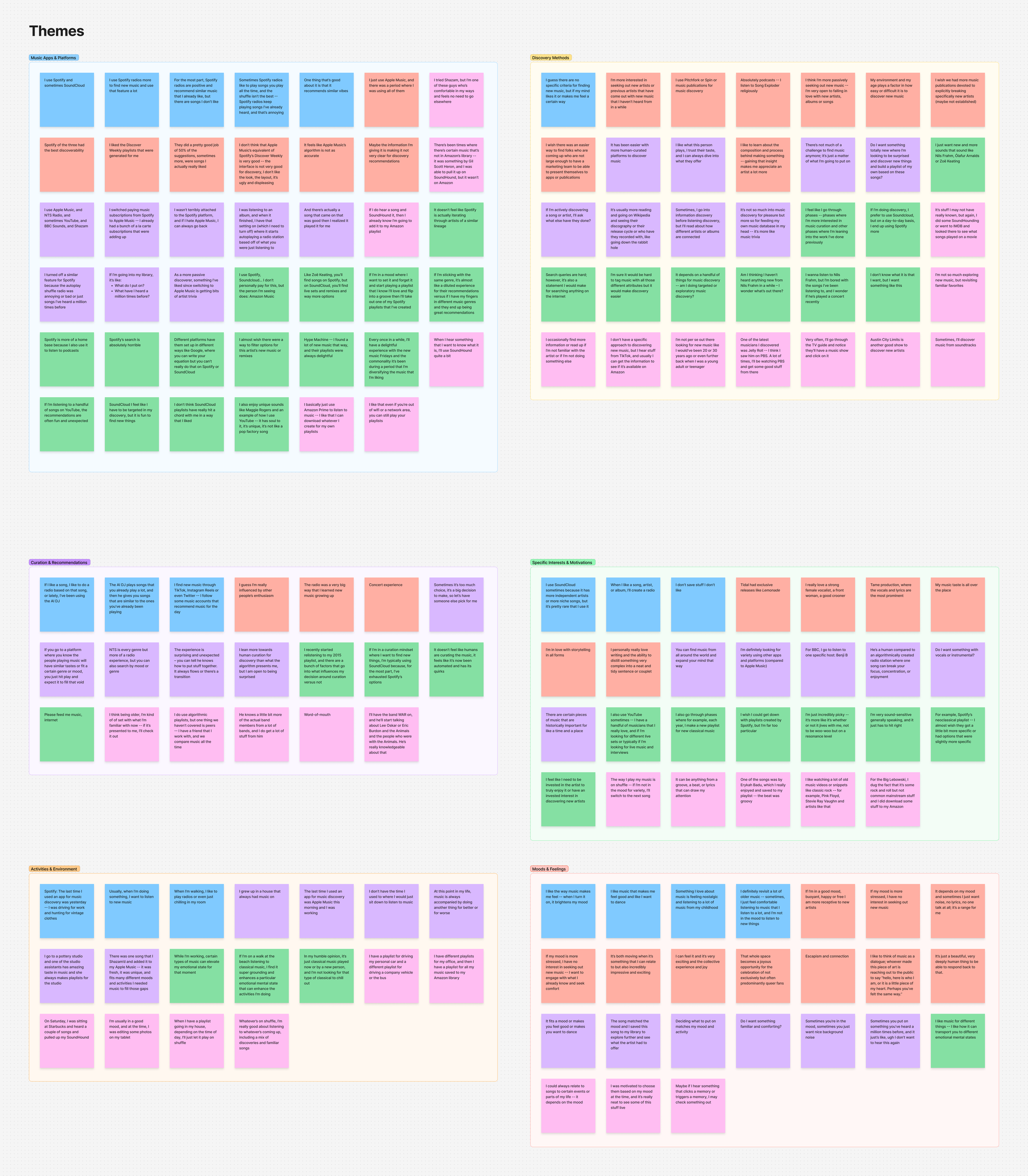
Research + Discovery
I interviewed five music listeners from diverse backgrounds to understand how the problem actually showed up in their lives. I went in with assumptions. Research quickly challenged most of them.


Who I Designed For
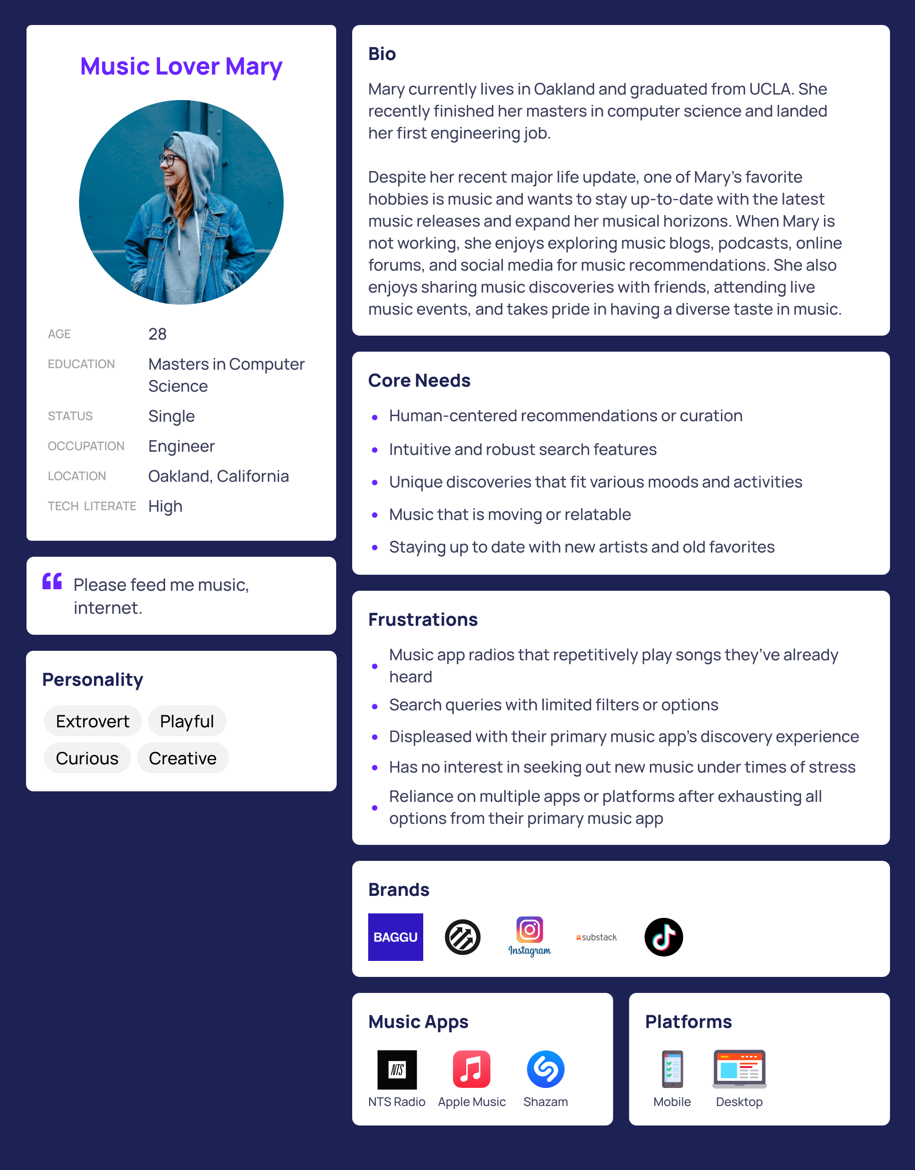
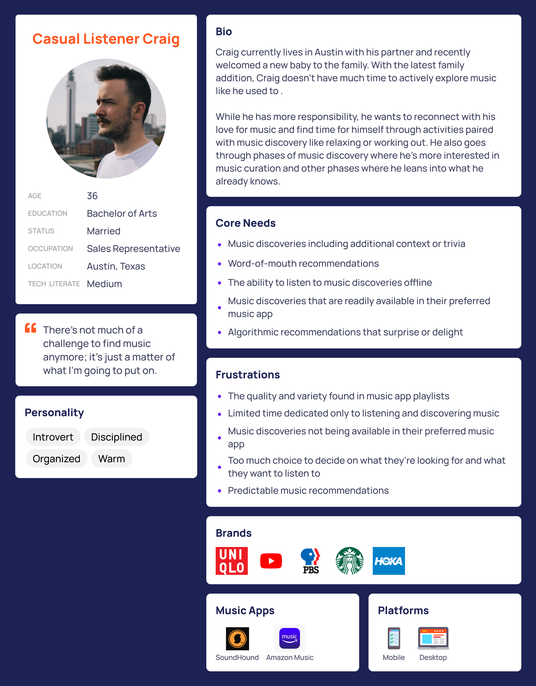
What I Heard
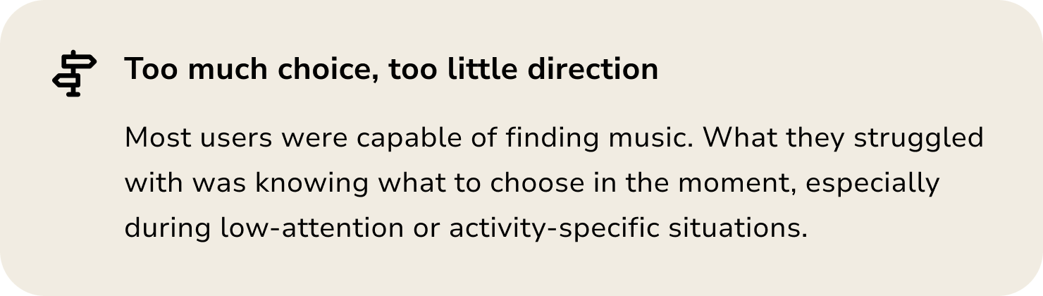
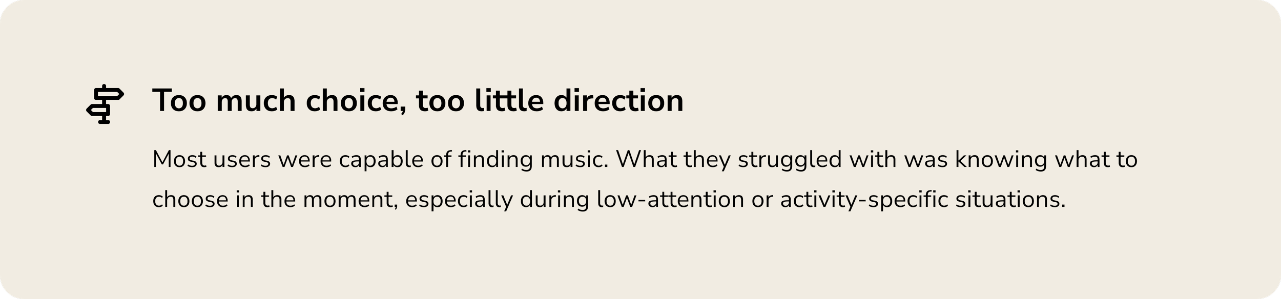
Decision Fatigue
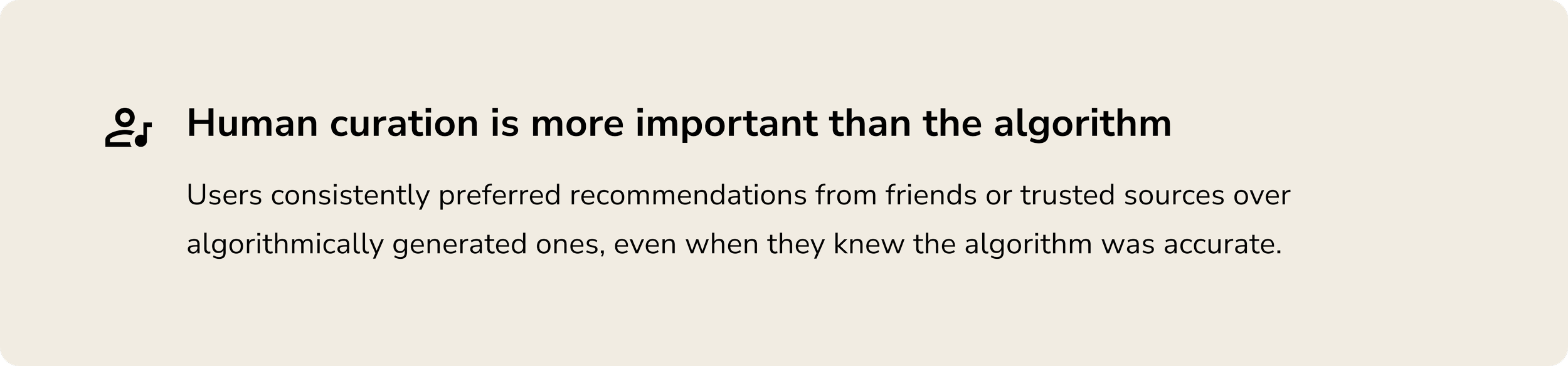
“It has been easier with more human-curated platforms to discover music. I like what this person plays, I trust their taste, and I can always dive into what they offer.”
Social Experience
“There’s an interior experience of music, and then there’s a more external group experience.”
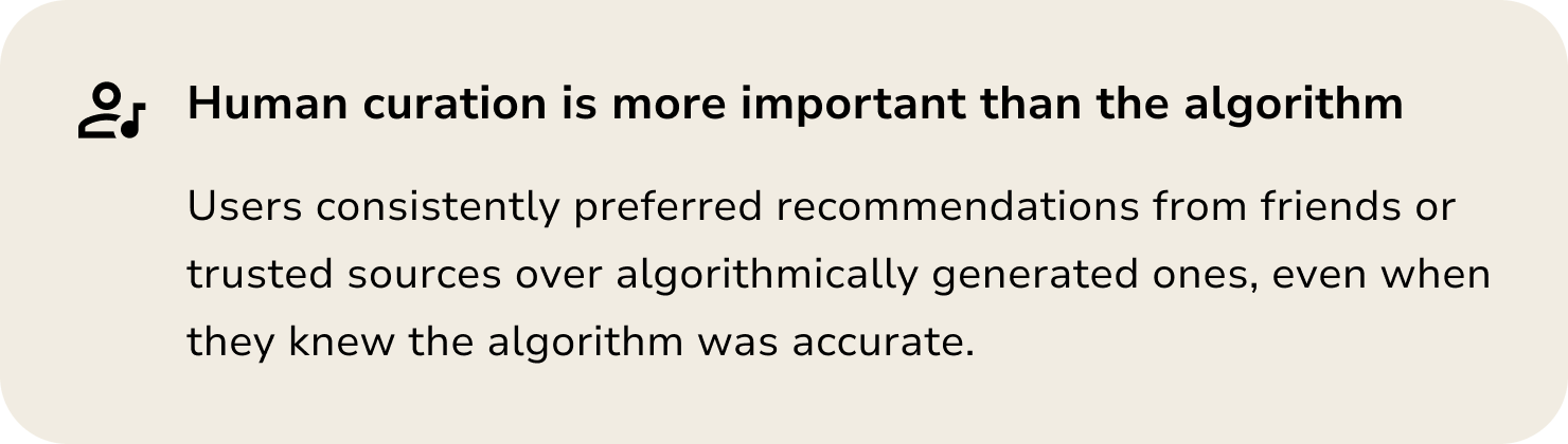
Human Curation
“There’s not much of a challenge to find music anymore. It’s just a matter of what I’m going to put on.”
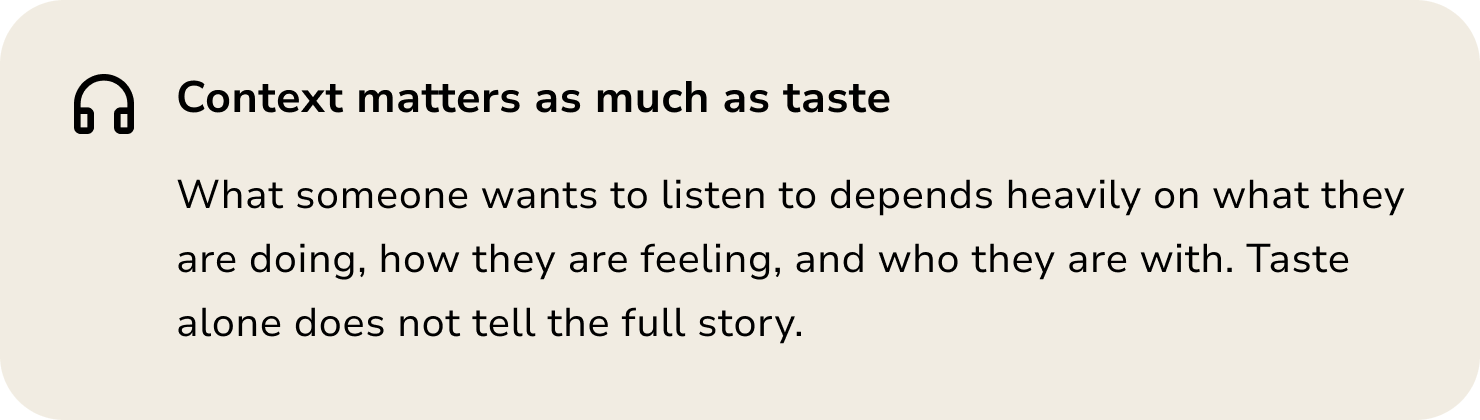
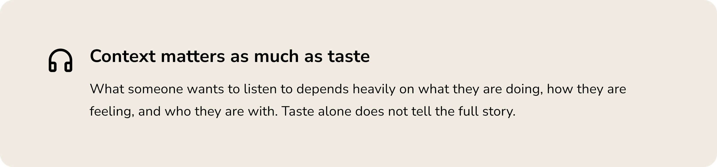
Context + Mood
“I like how music can transport you to different emotional mental states. Certain types of music can elevate my emotional state for that moment and enhance the activities I’m doing.”
Key Findings
Design Process
I kept early sketches simple and focused. The goal was clarity over polish, understanding how inputs made during onboarding would ripple into core experiences like sharing music or reviewing recommendations.
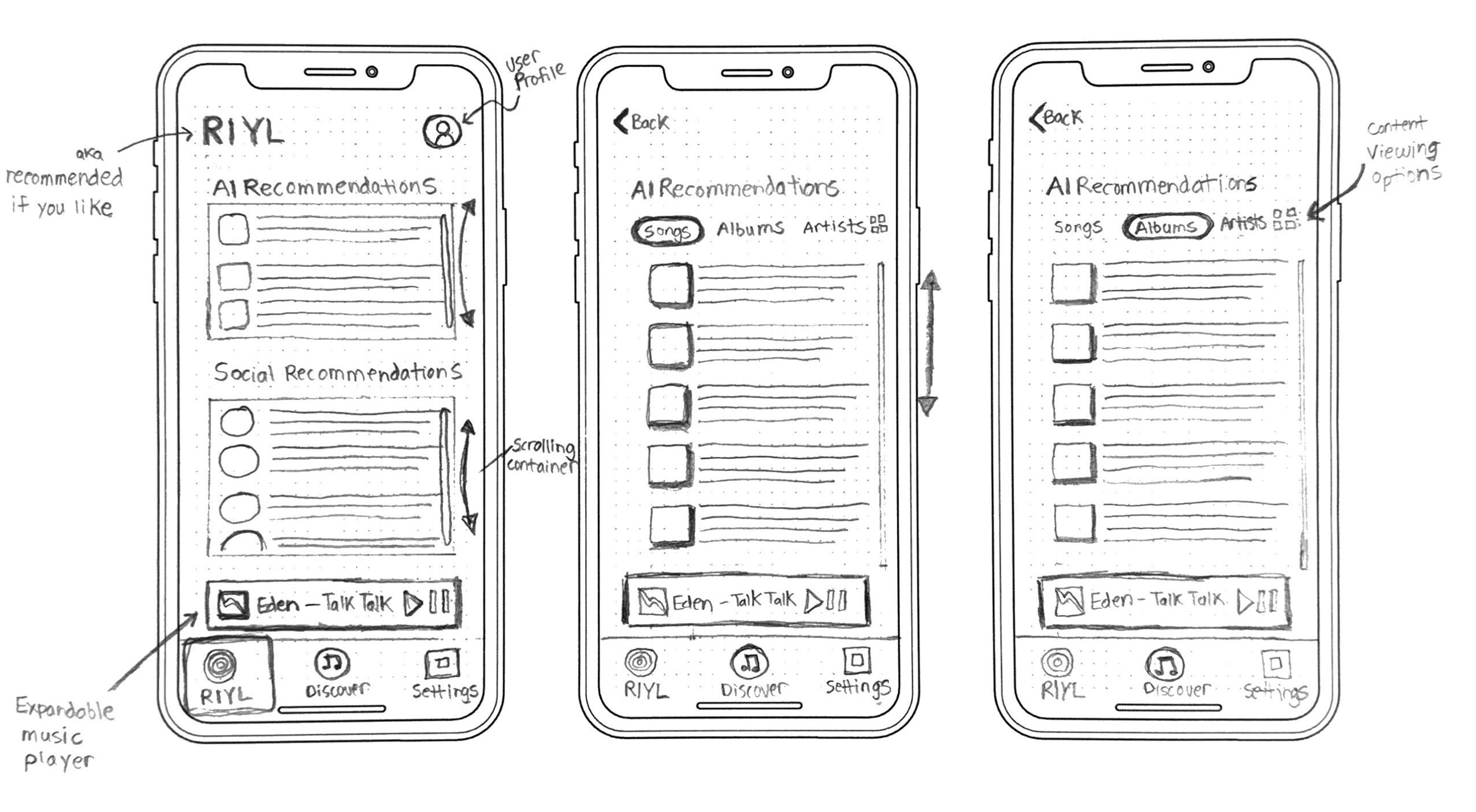
From Sketches to Wireframes
Guerrilla testing taught me quickly that simplicity was the priority. The more cluttered the screen, the more overwhelmed users felt. Working in lo-fi also made it easier to catch missing states early before investing in prototyping.
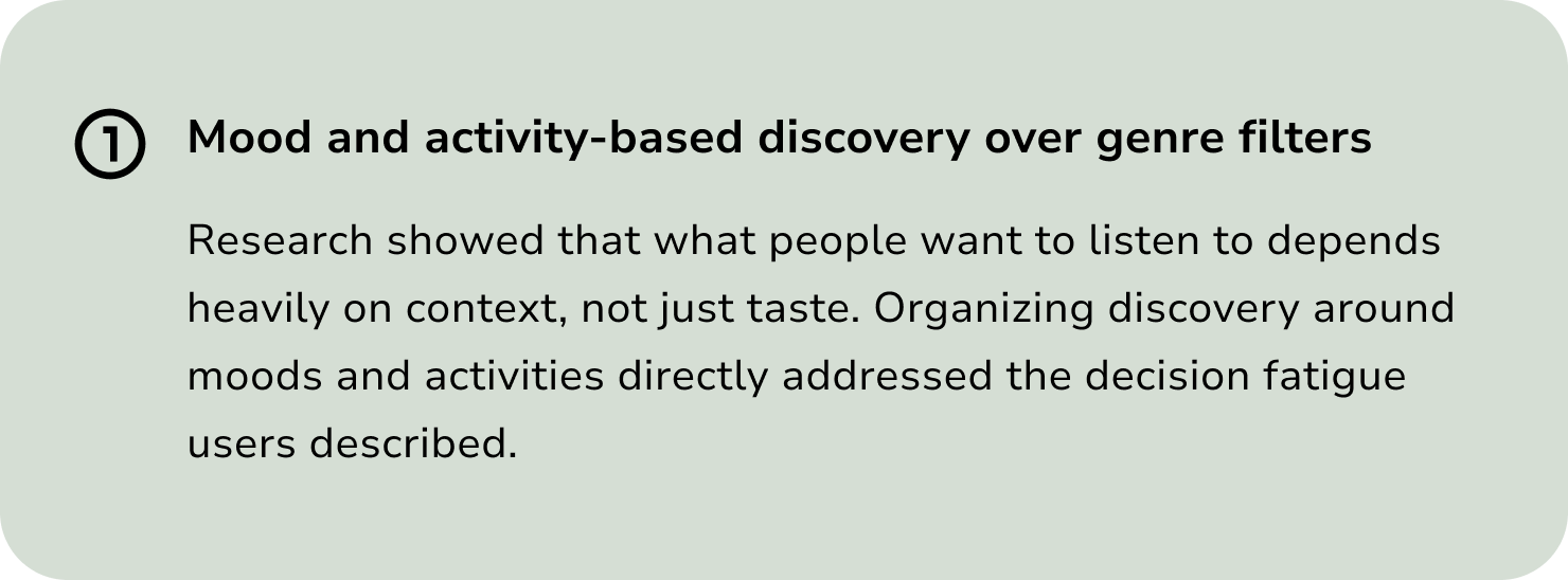
Three Decisions That Shaped the Experience
Usability Testing
I ran two rounds of moderated usability testing, five participants each, conducted with a mix of remote and in-person sessions. The goal was not to validate what I had built but to find where it broke down and why.
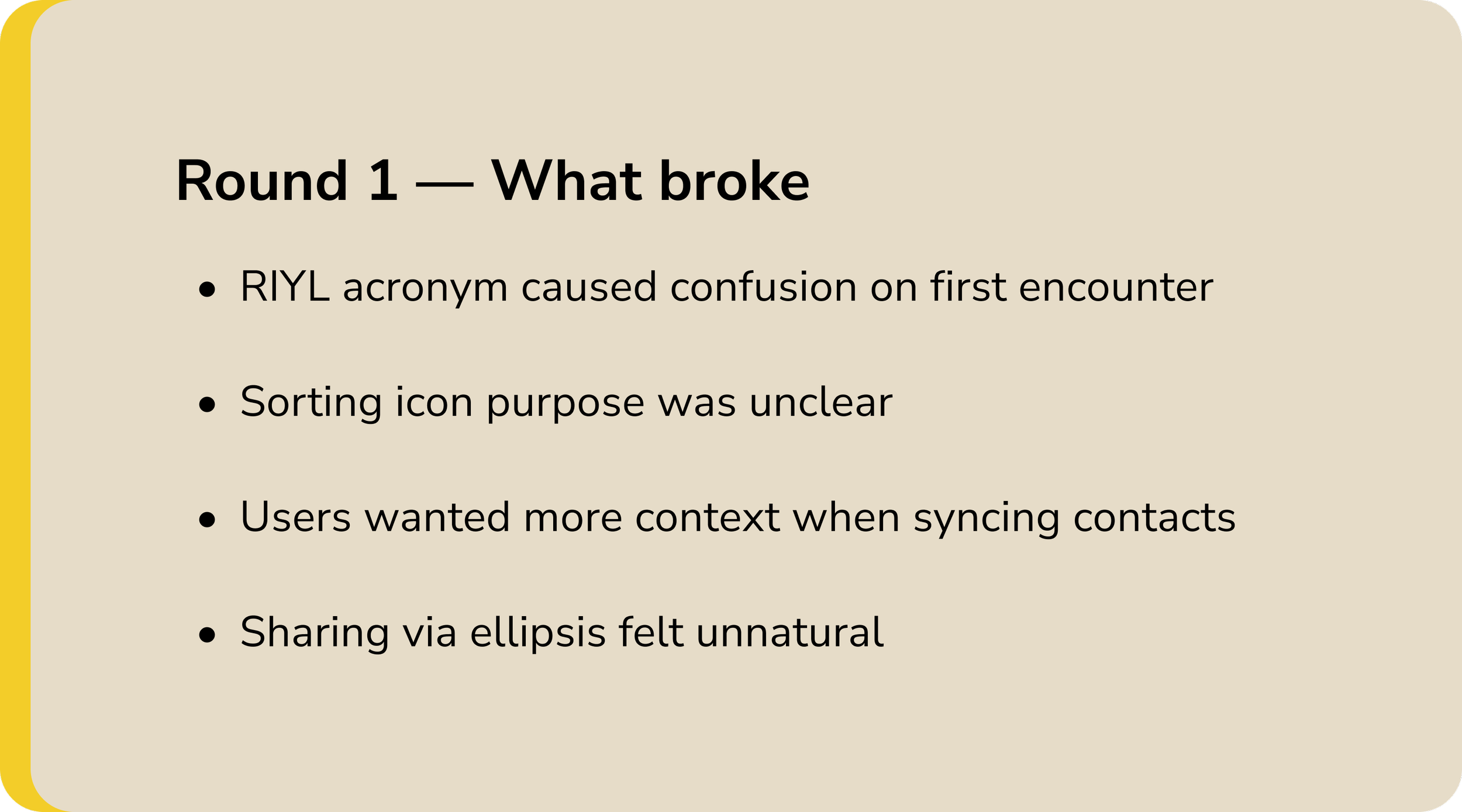
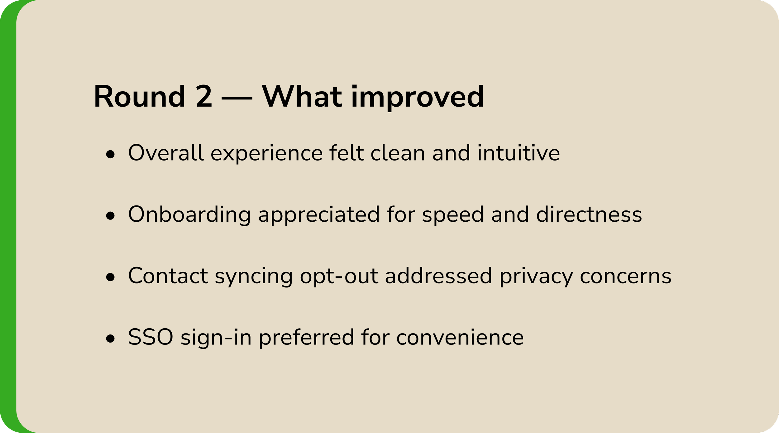
What Participants Said
Navigation
“There are not a lot of options in a good way. It just directs you to pick the thing and directs you there easily.”
Sharing
“There’s an indication the music was sent, so that means my friend knows I’m thinking about them.”
Discovery
“The registration process was really simple and to the point. There wasn’t too much noise. The recommendation process was also really quick — other apps take too much time to curate your For You page and I just give up.”
Delight
“The way it is all laid out is like butter.”
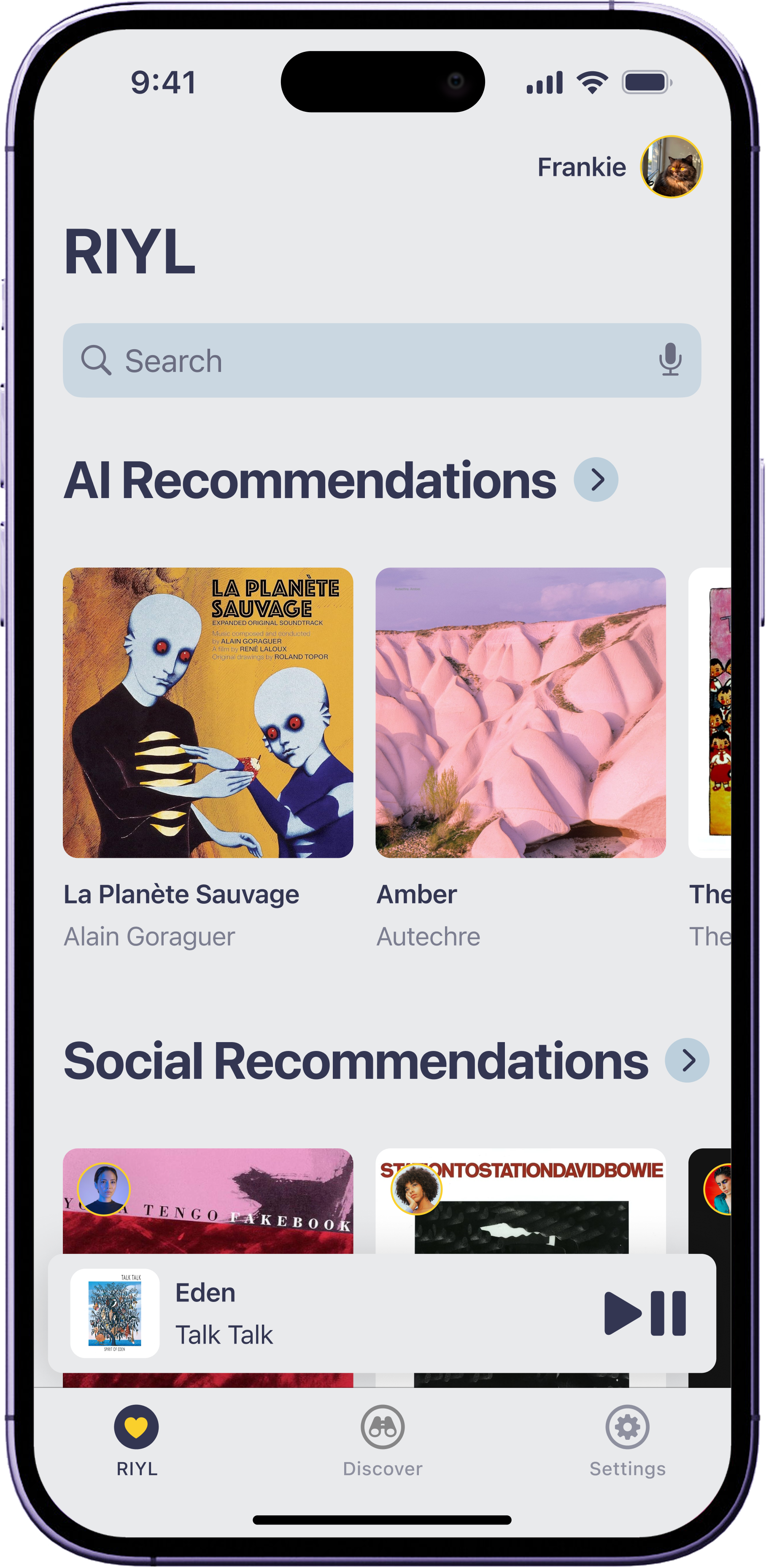
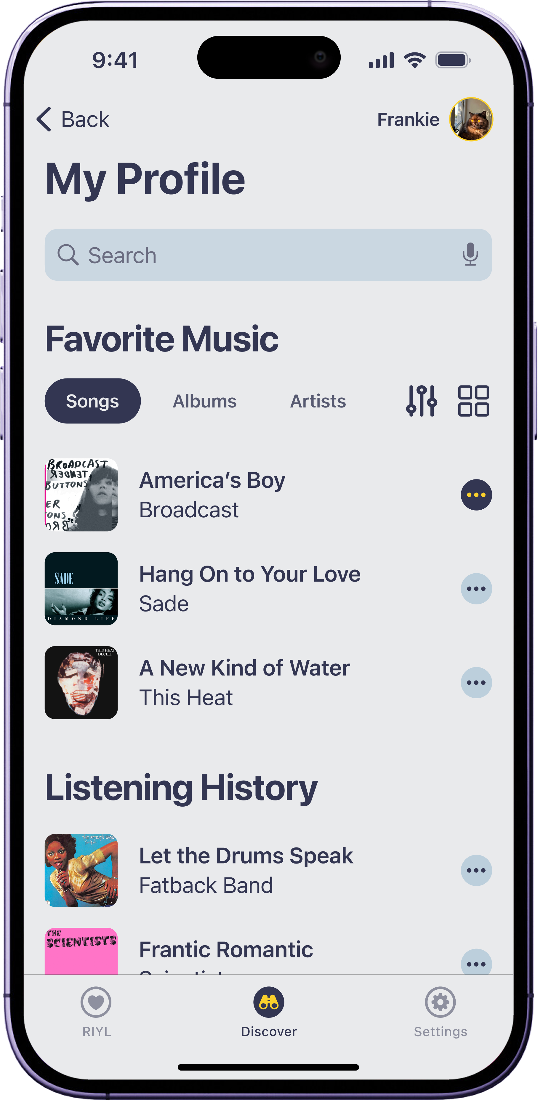
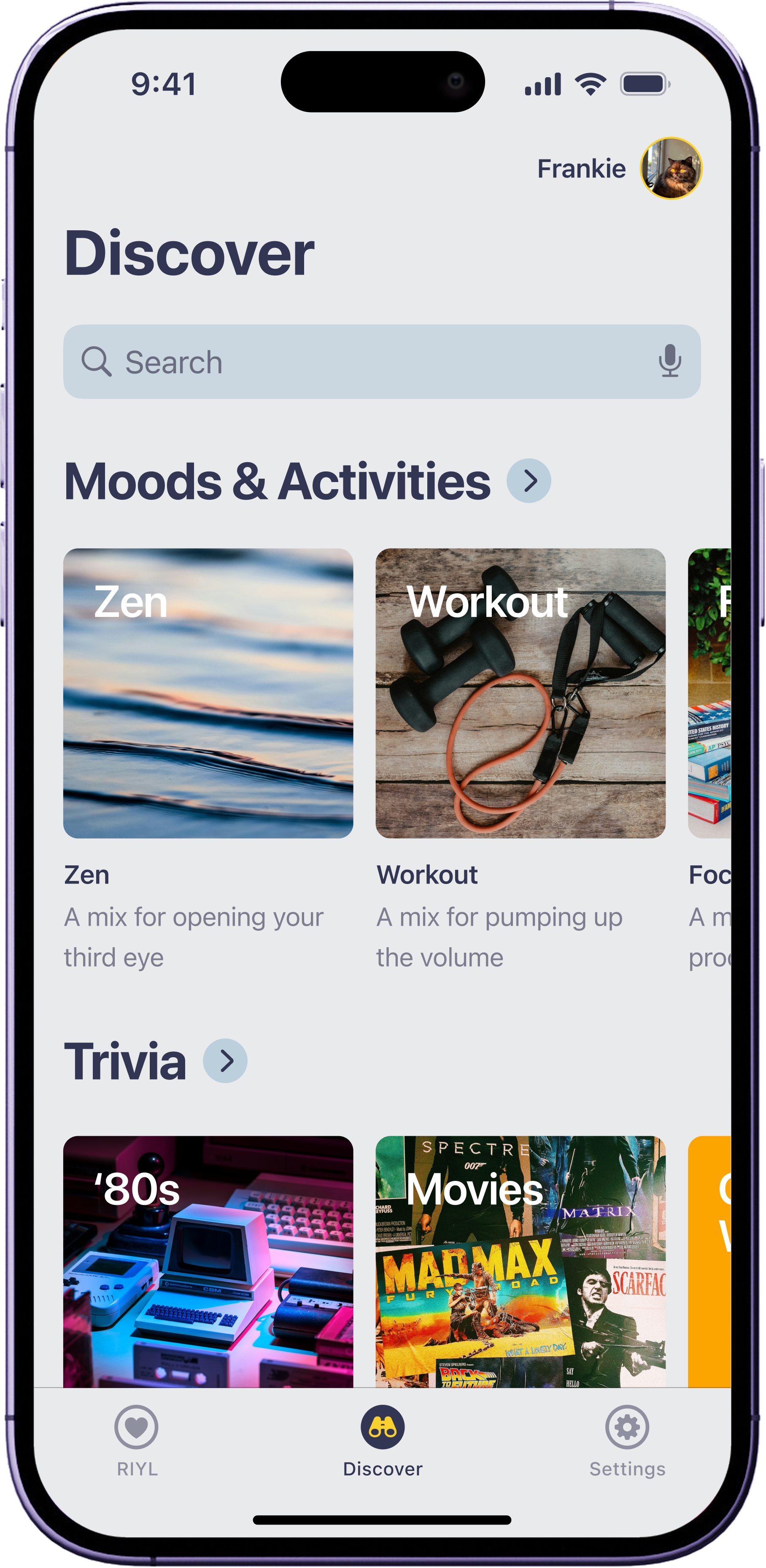
The Design
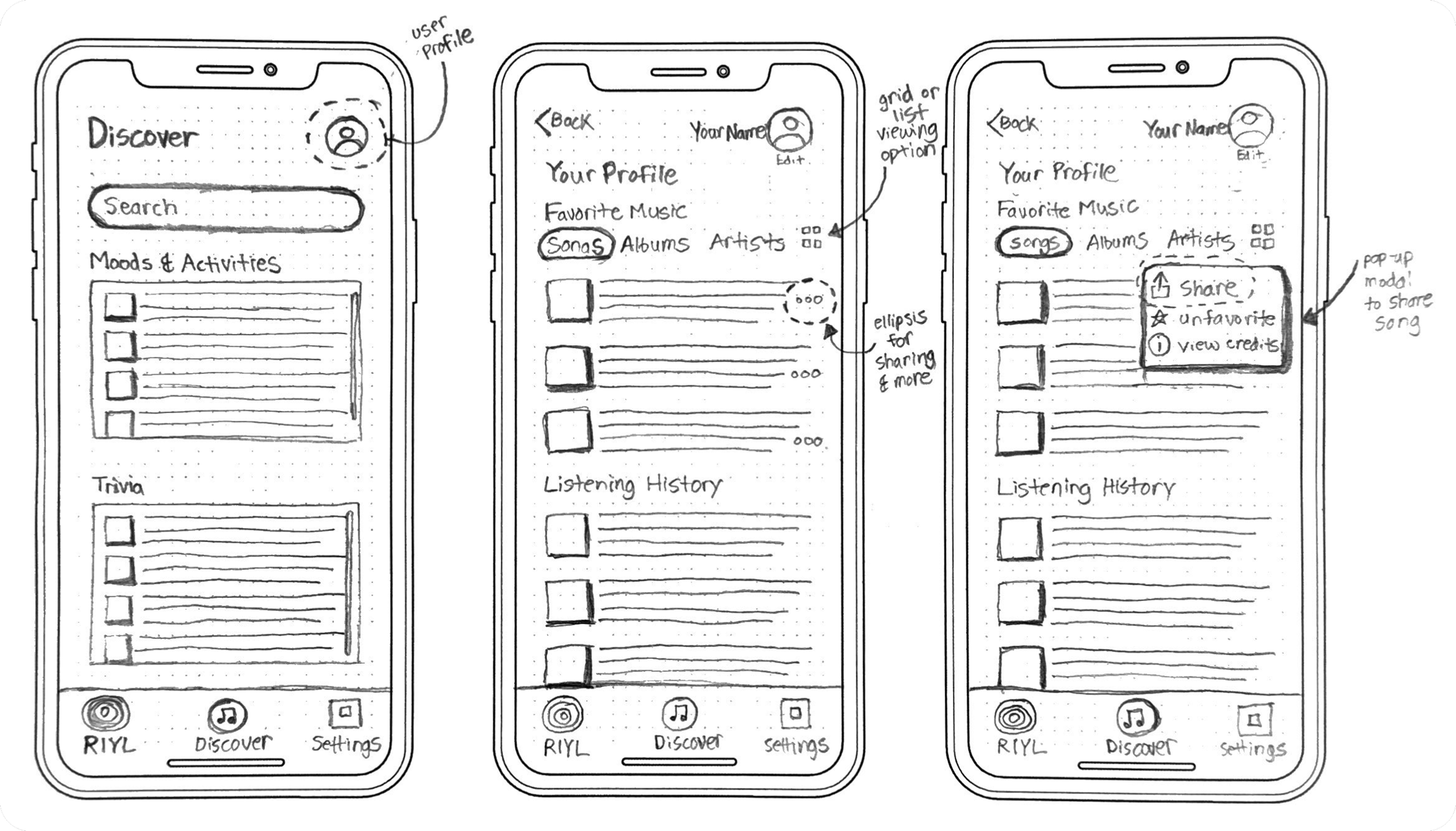
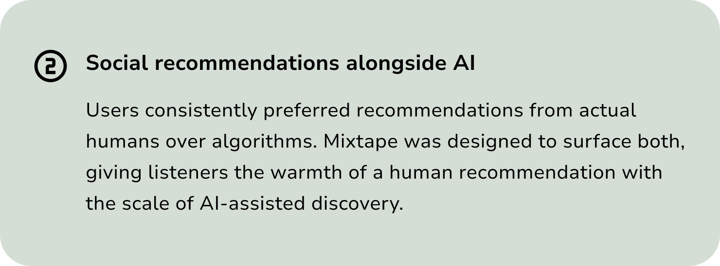
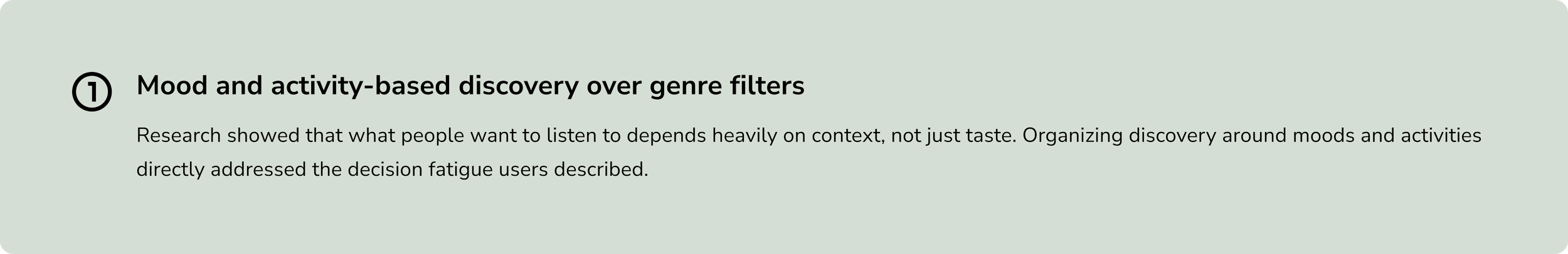
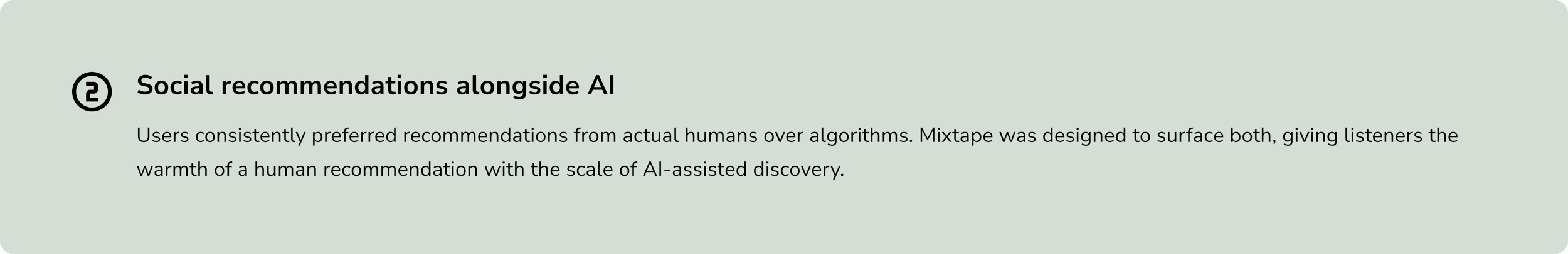
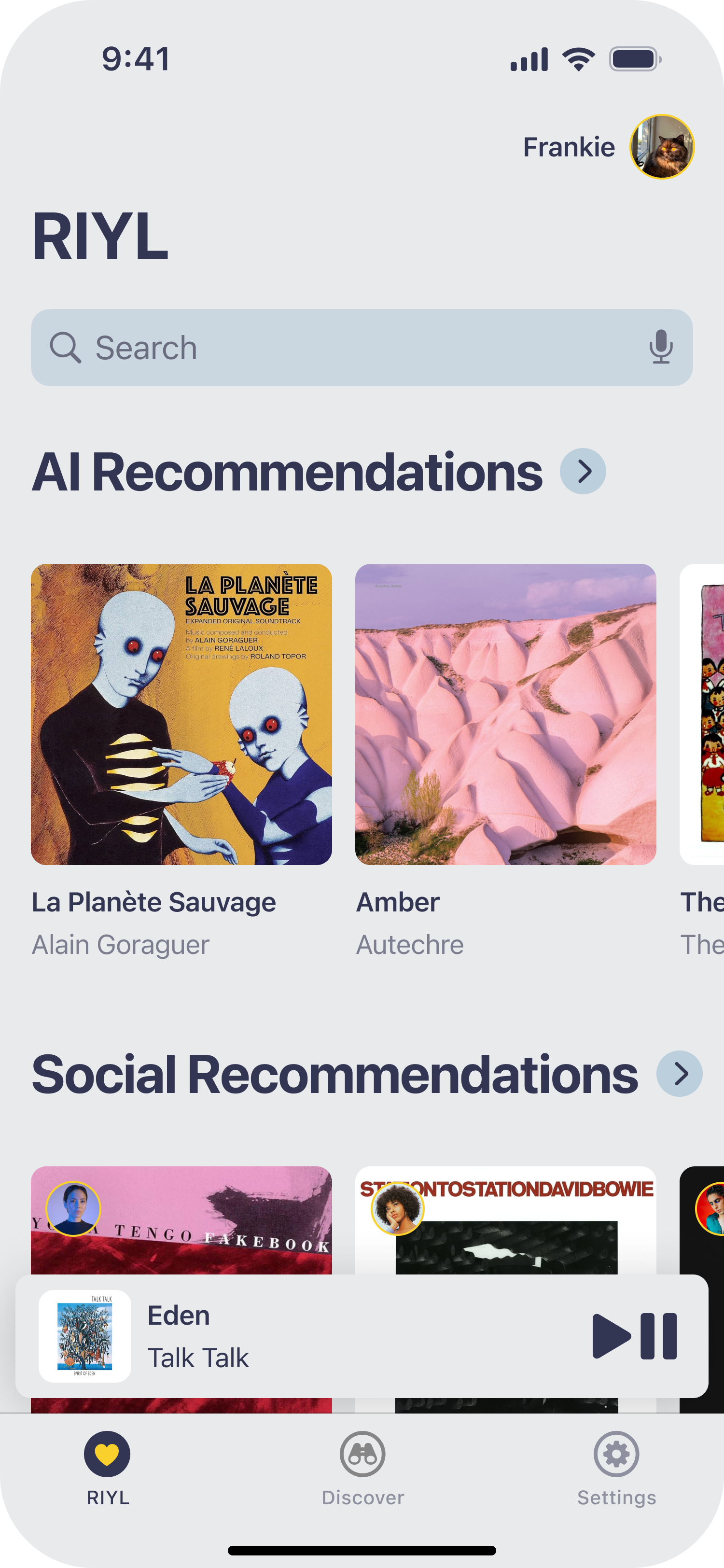
Mixtape brings together three core experiences: a mood and activity-based discovery feed, a social recommendations layer powered by people you trust, and an AI recommendations section that works quietly in the background.
Onboarding Flow
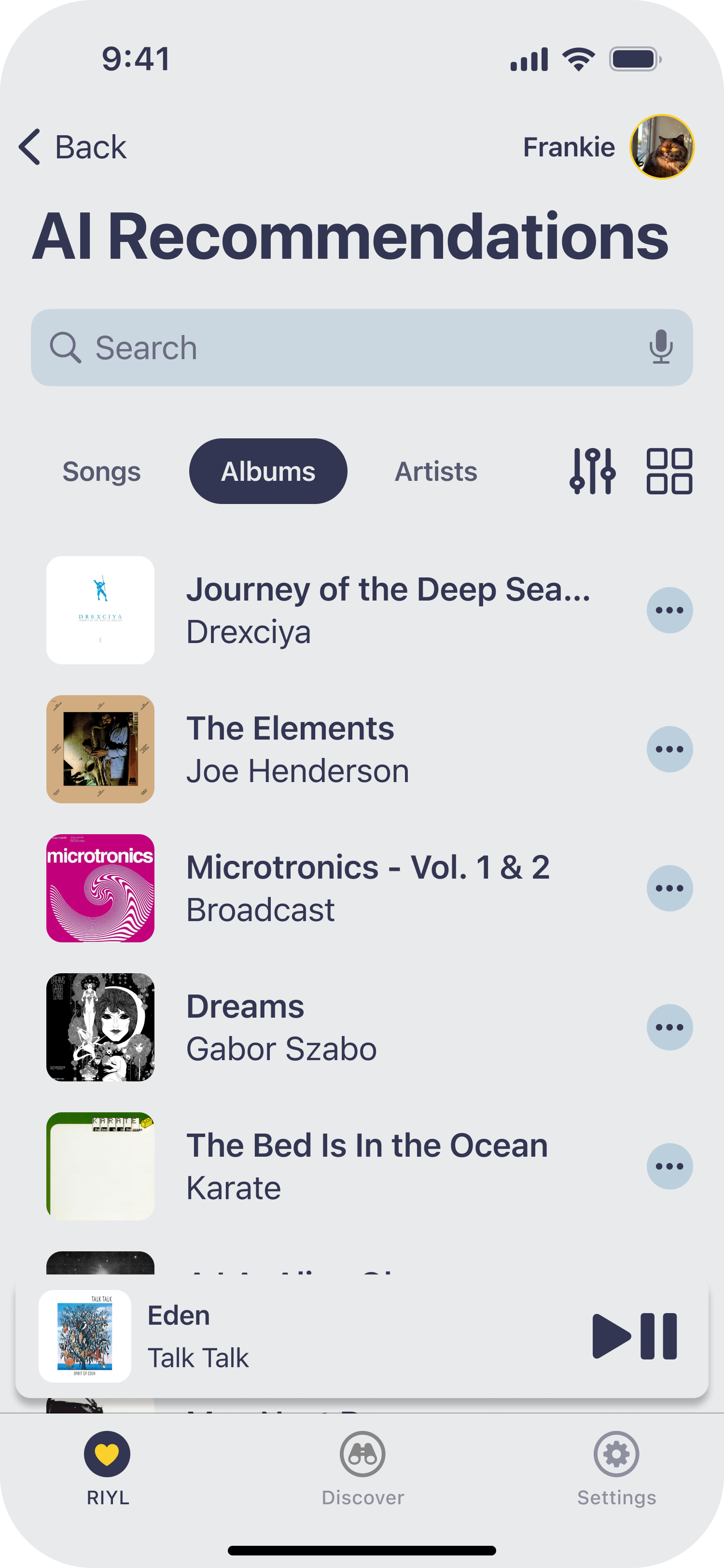
Tapping Albums displays your recommended albums.
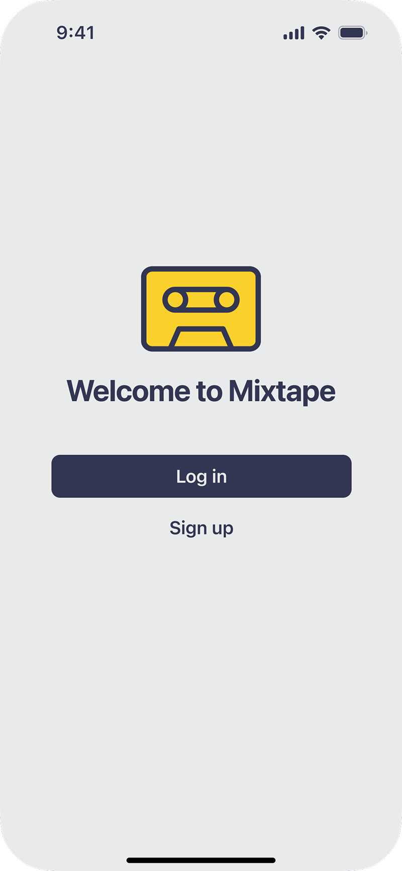
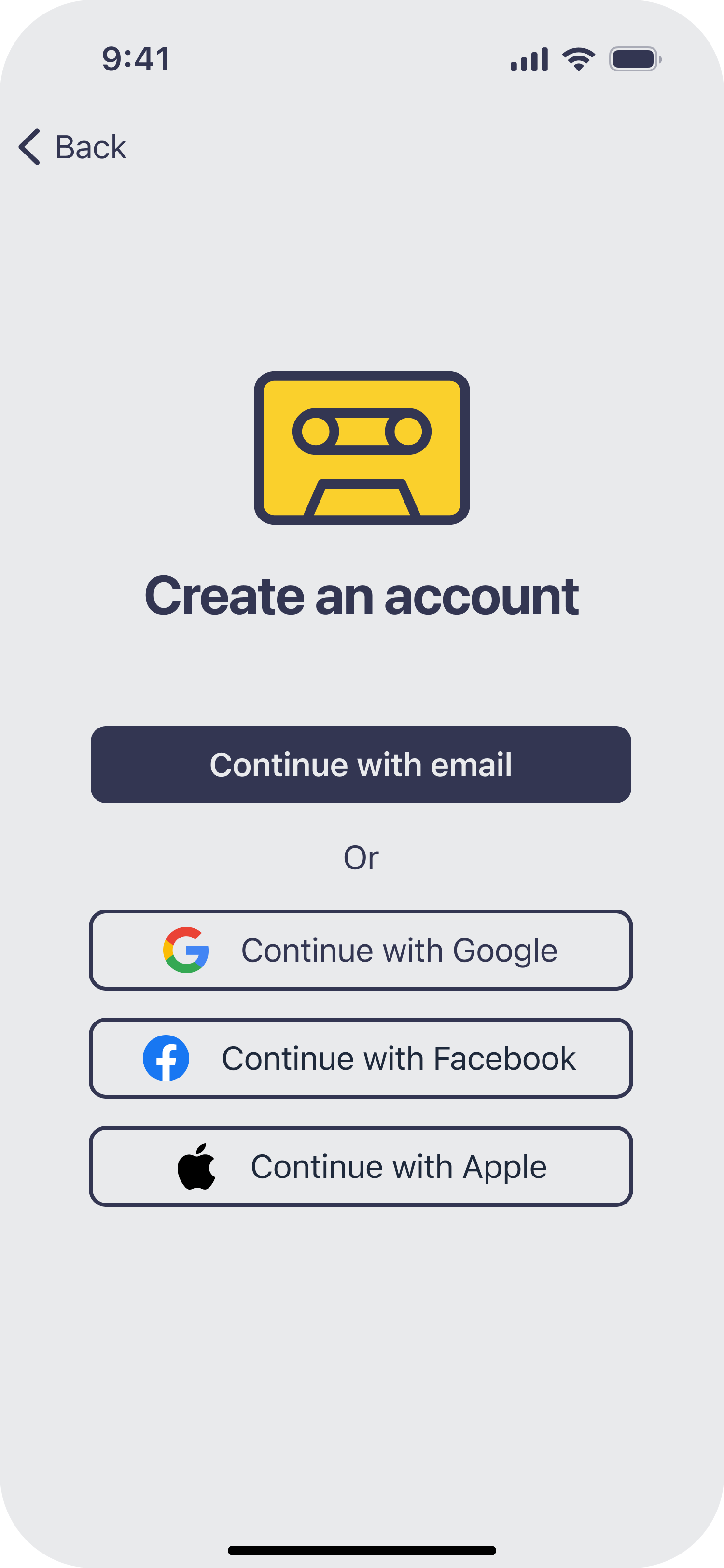
Start by tapping Sign up to create a Mixtape account.
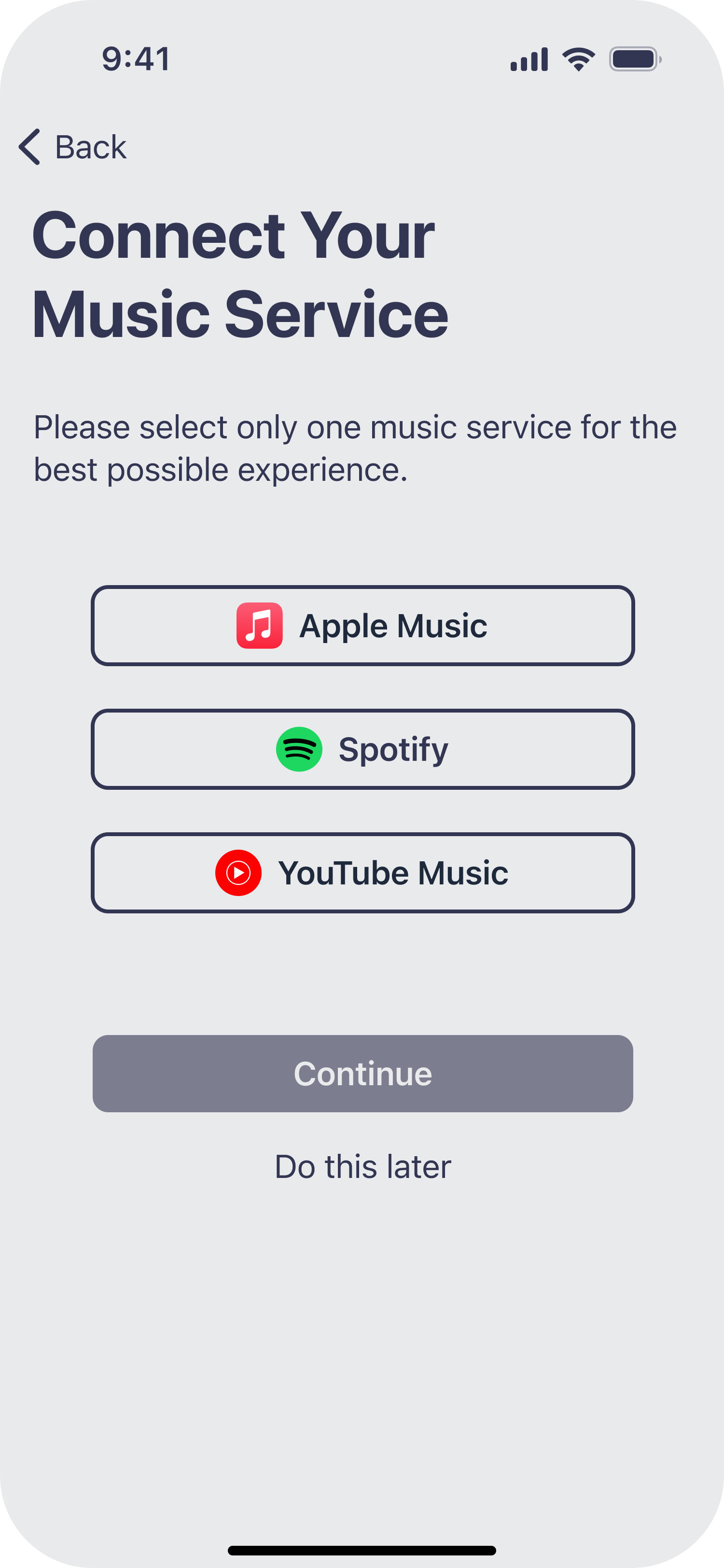
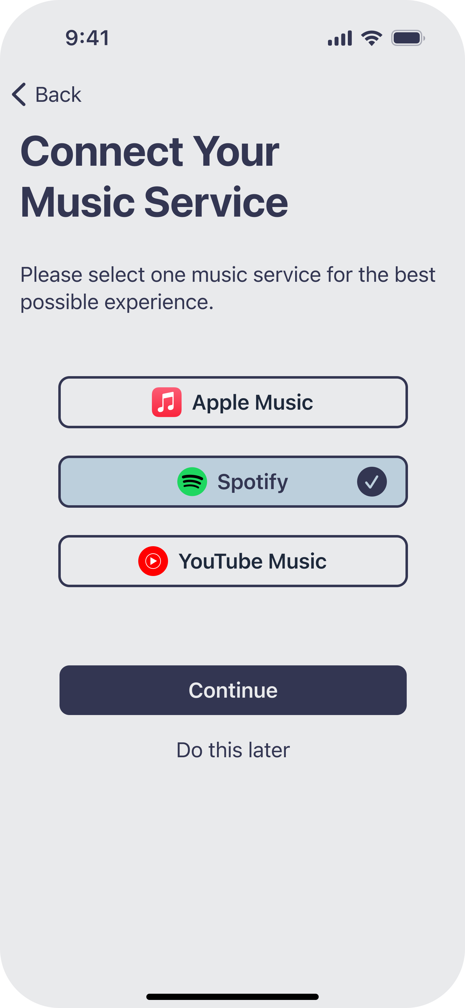
View available music services to connect to Mixtape.
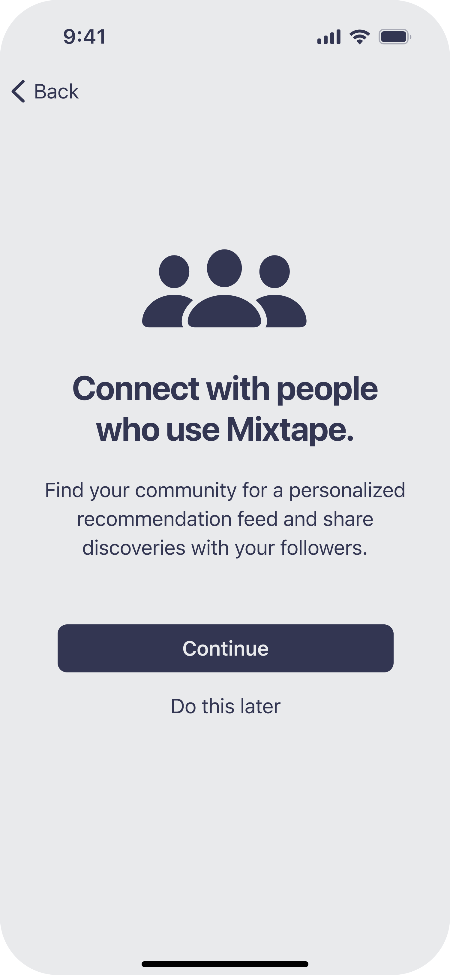
Read request to sync contacts, then tap Continue.
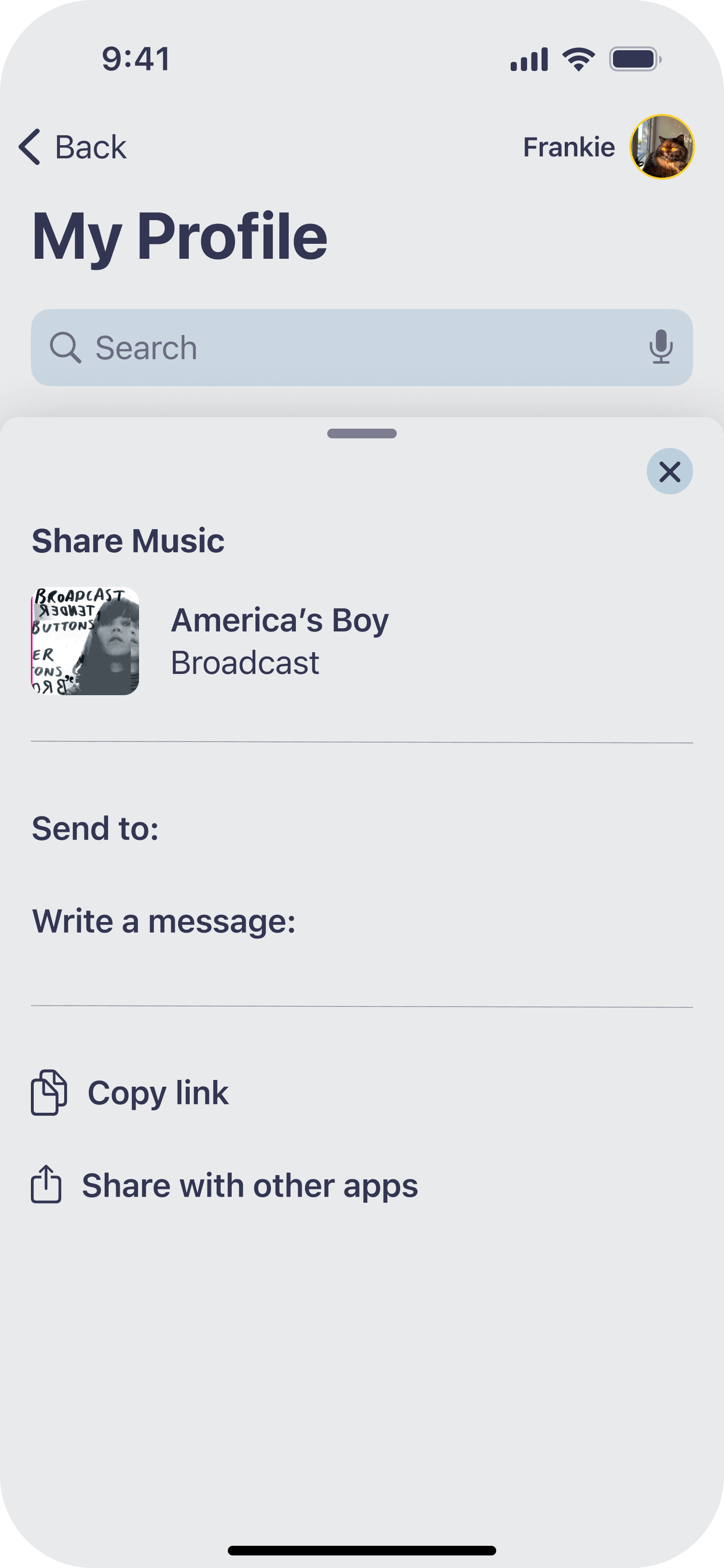
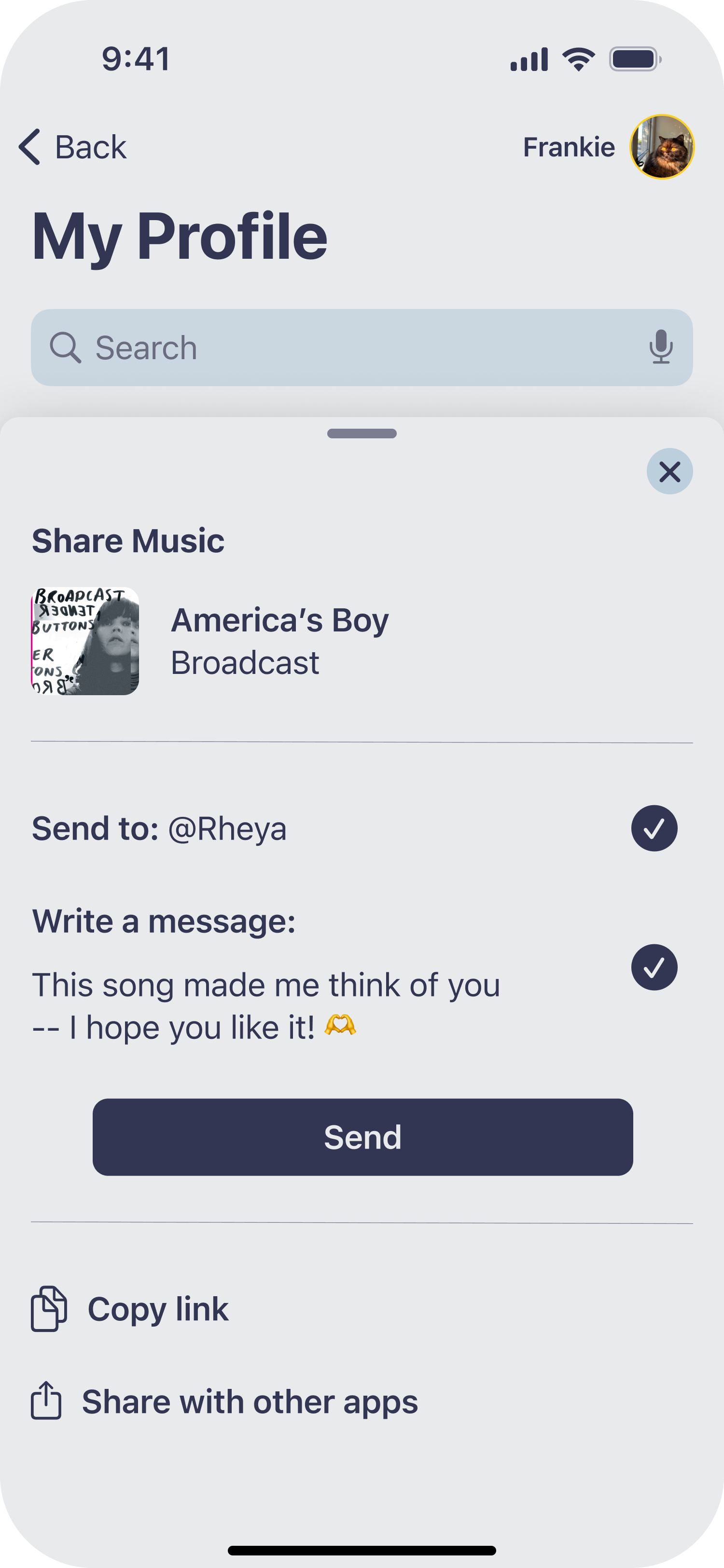
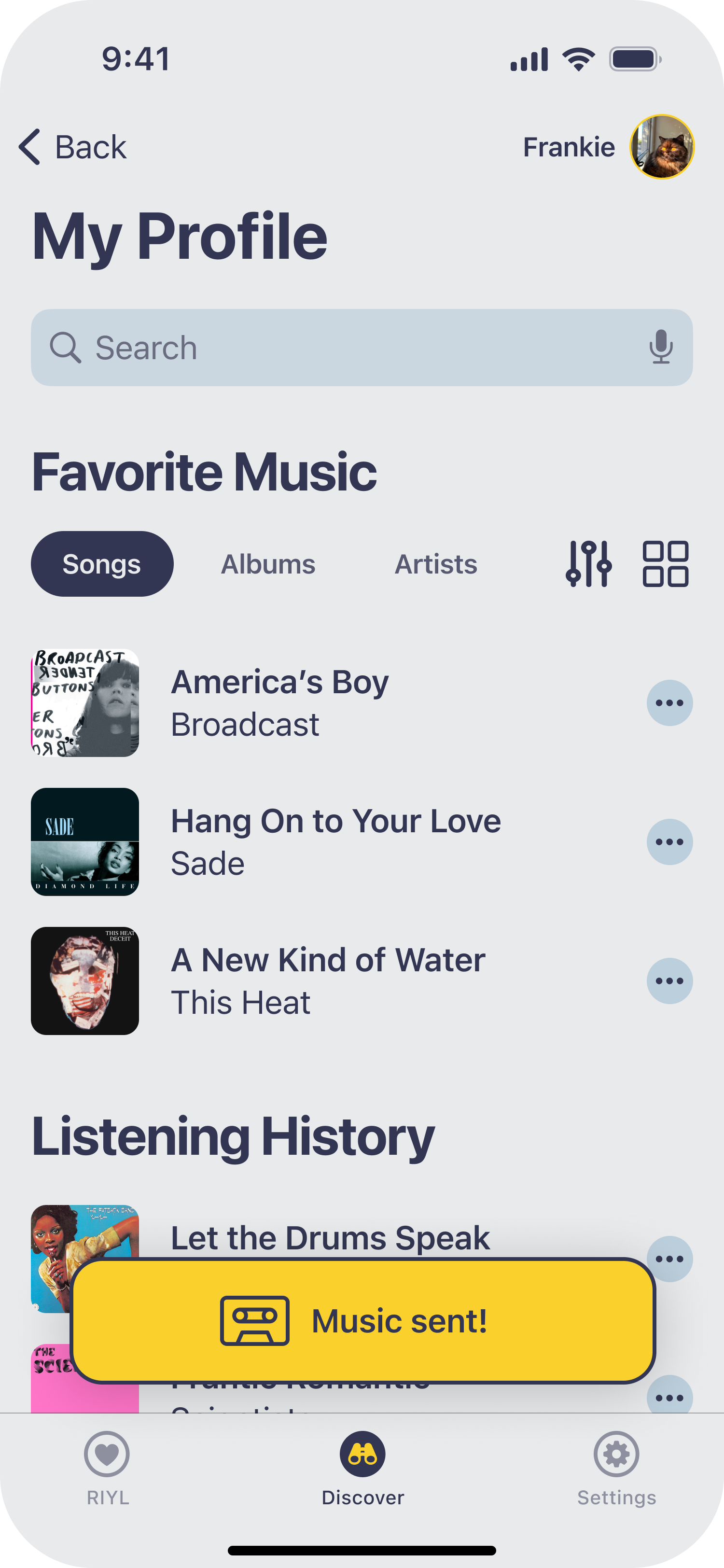
Sharing Music Discoveries
Review Share Music controller, plus options to share outside the app.
From Discovery to Listening
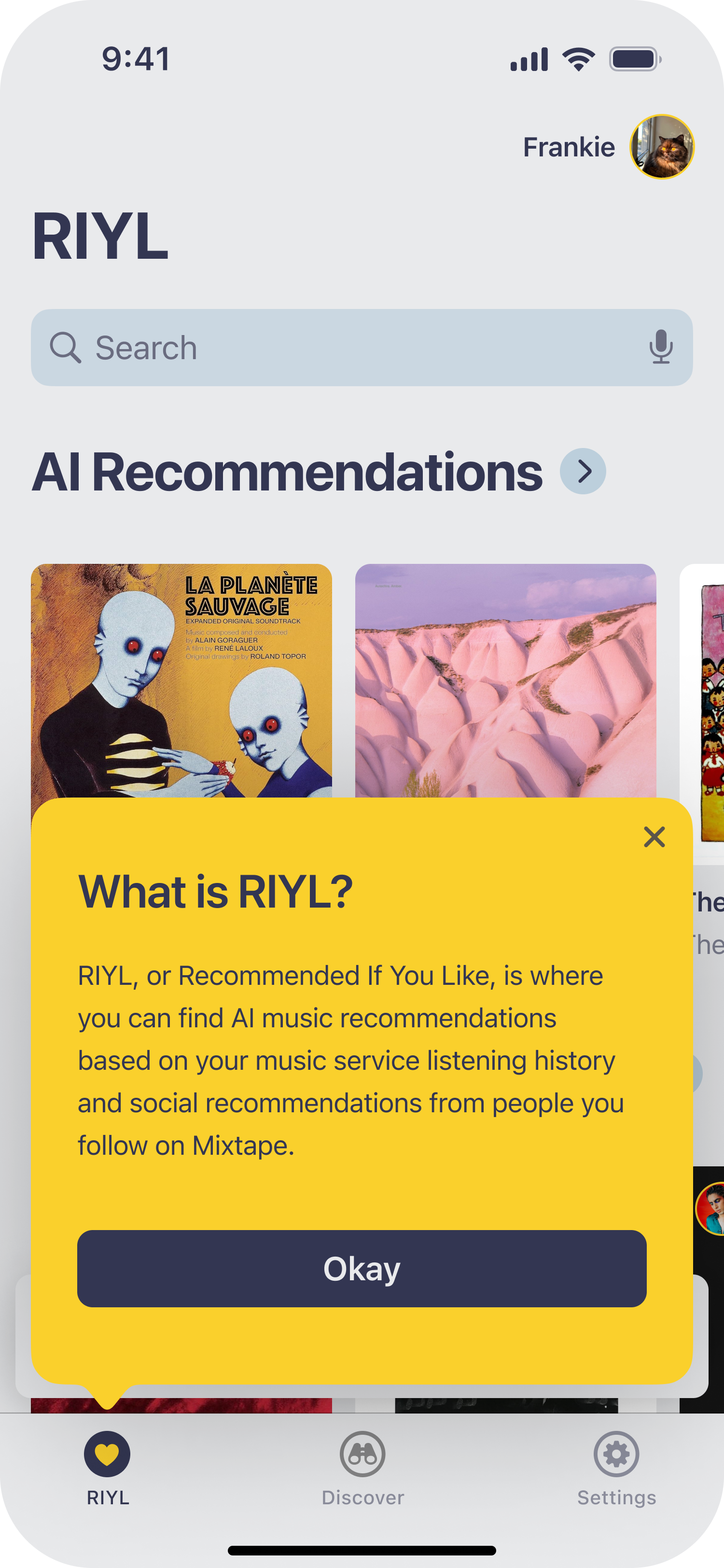
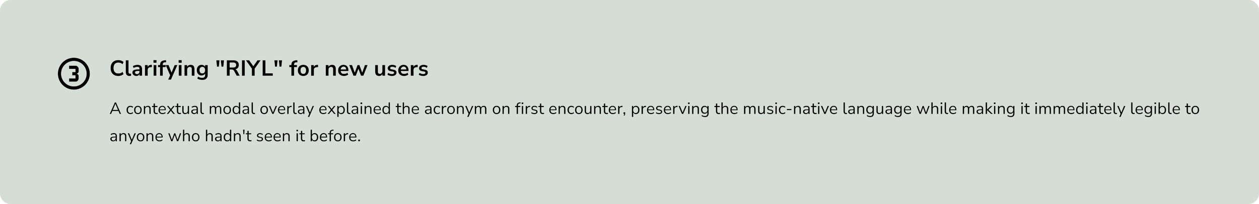
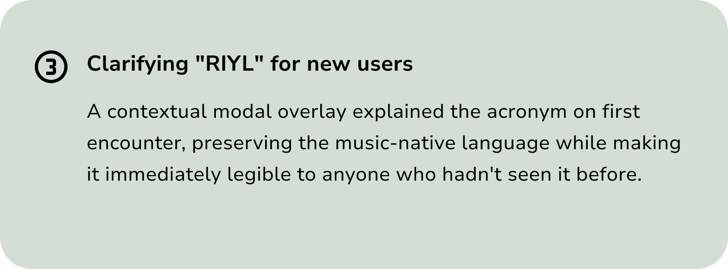
First-time users see a contextual modal overlay explaining RIYL before engaging with the feed.
Tap Continue with email to begin the account creation process.
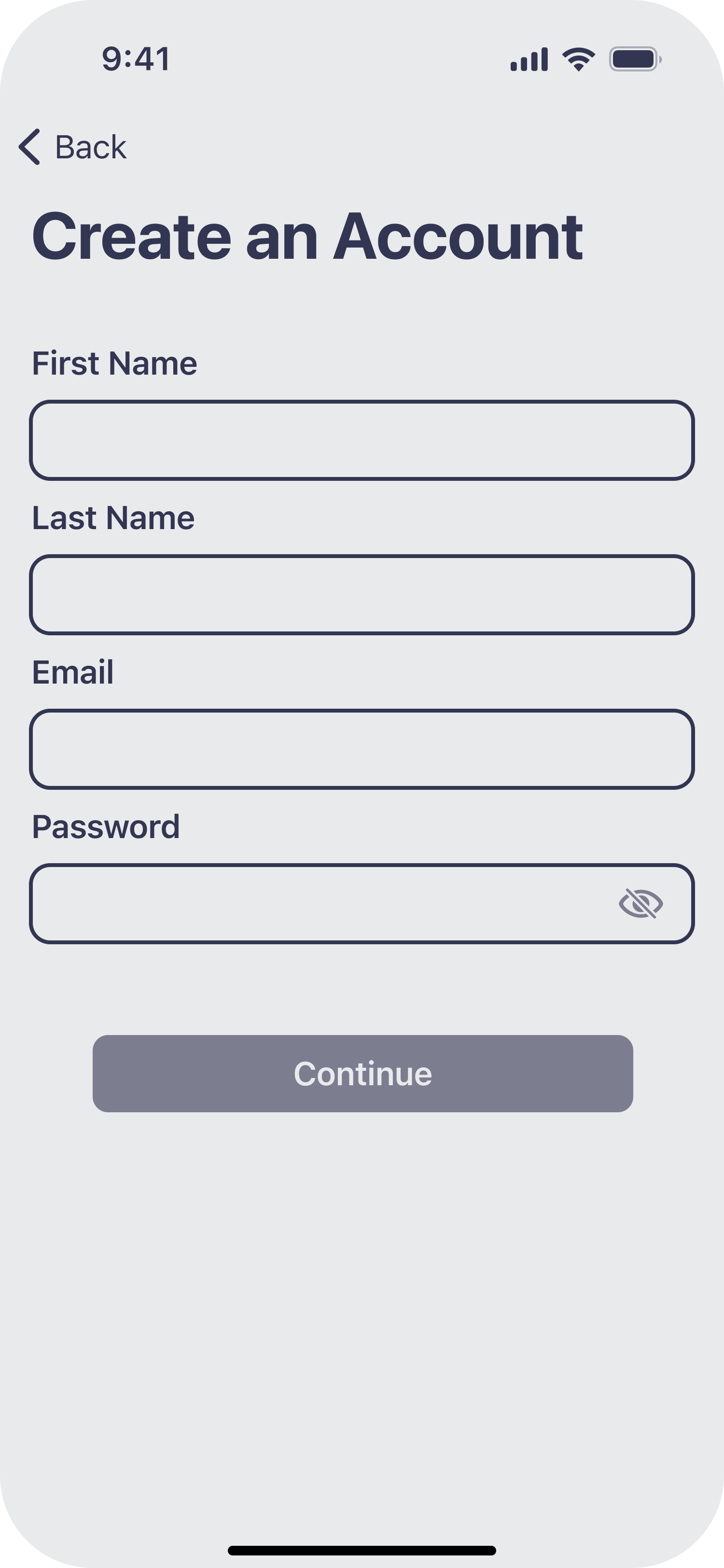
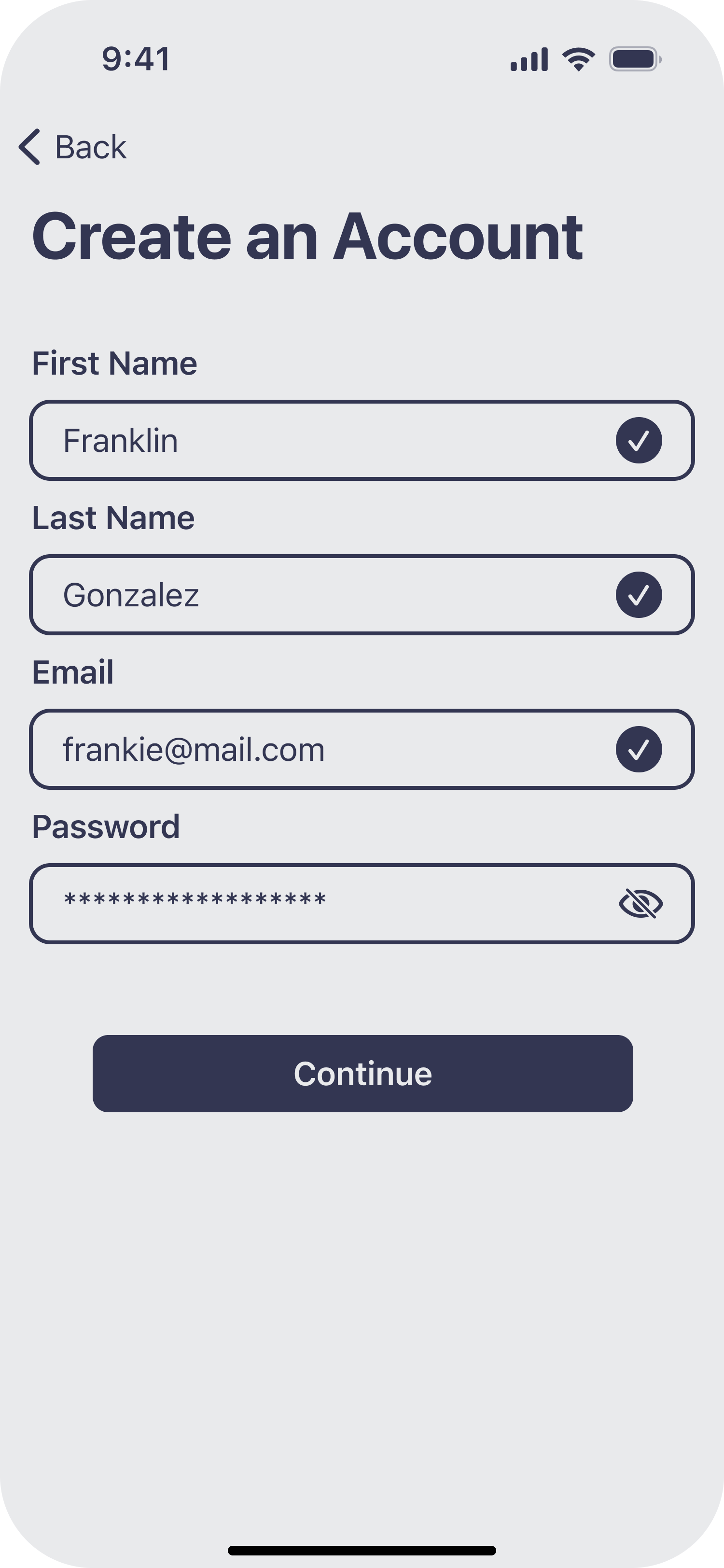
View the requested info to create an account.
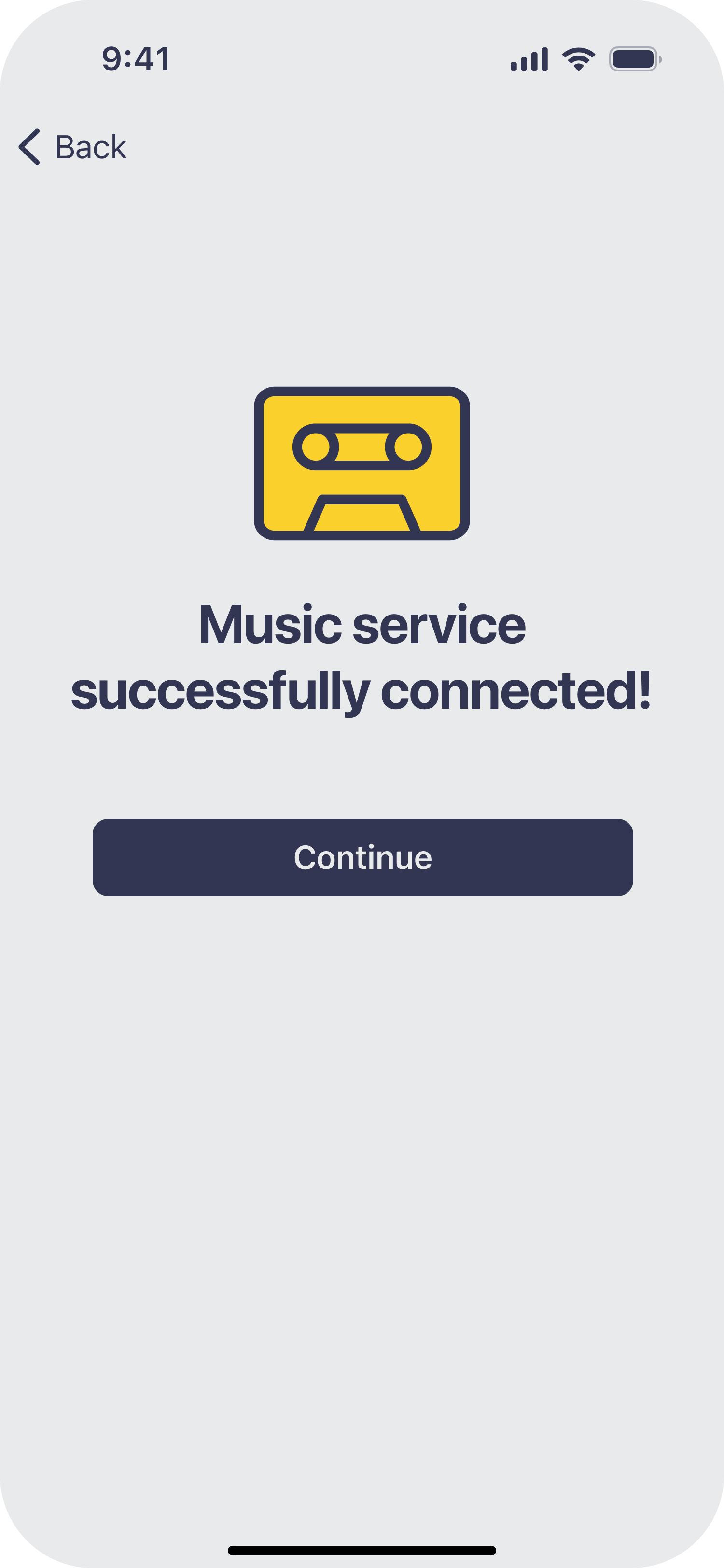
Read success message then tap Continue.
Select Spotify then tap Continue.
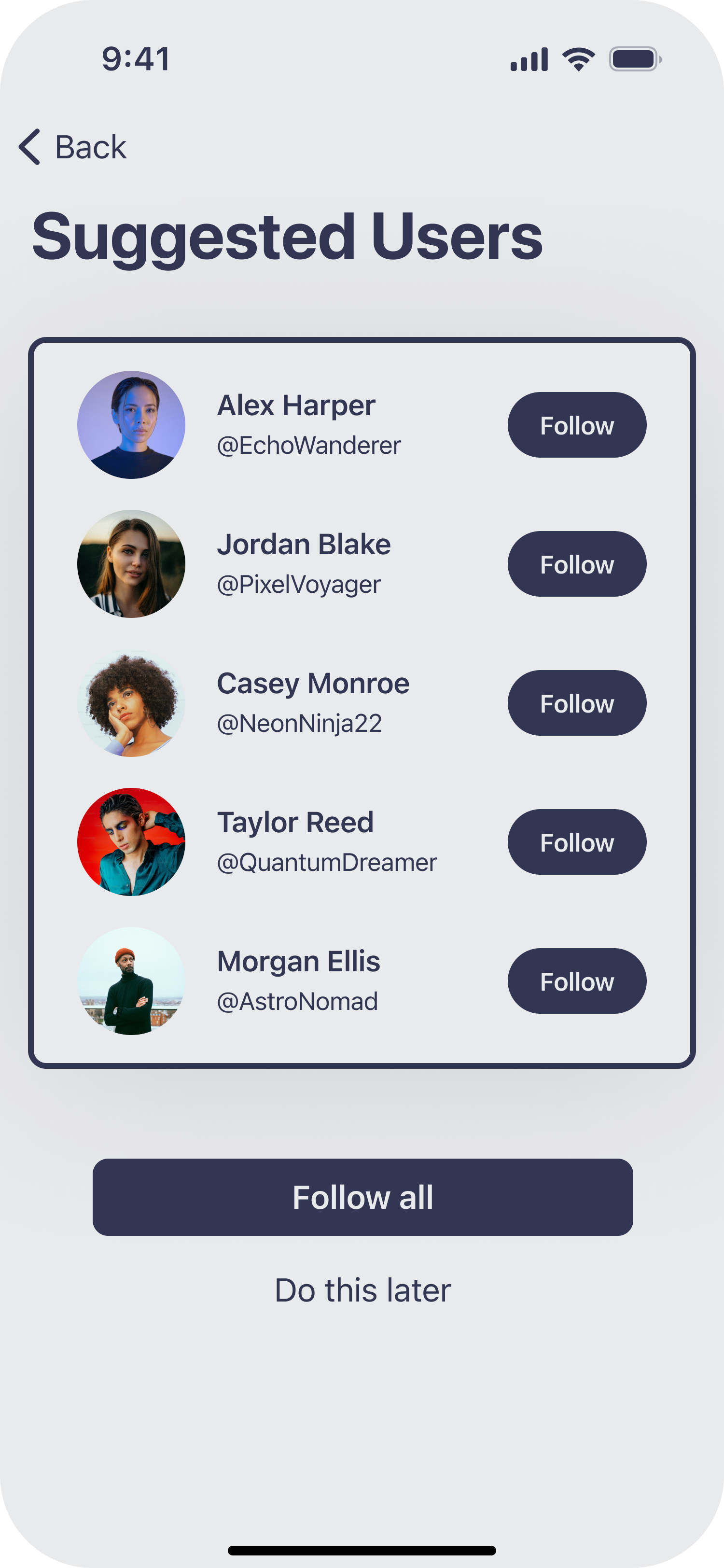
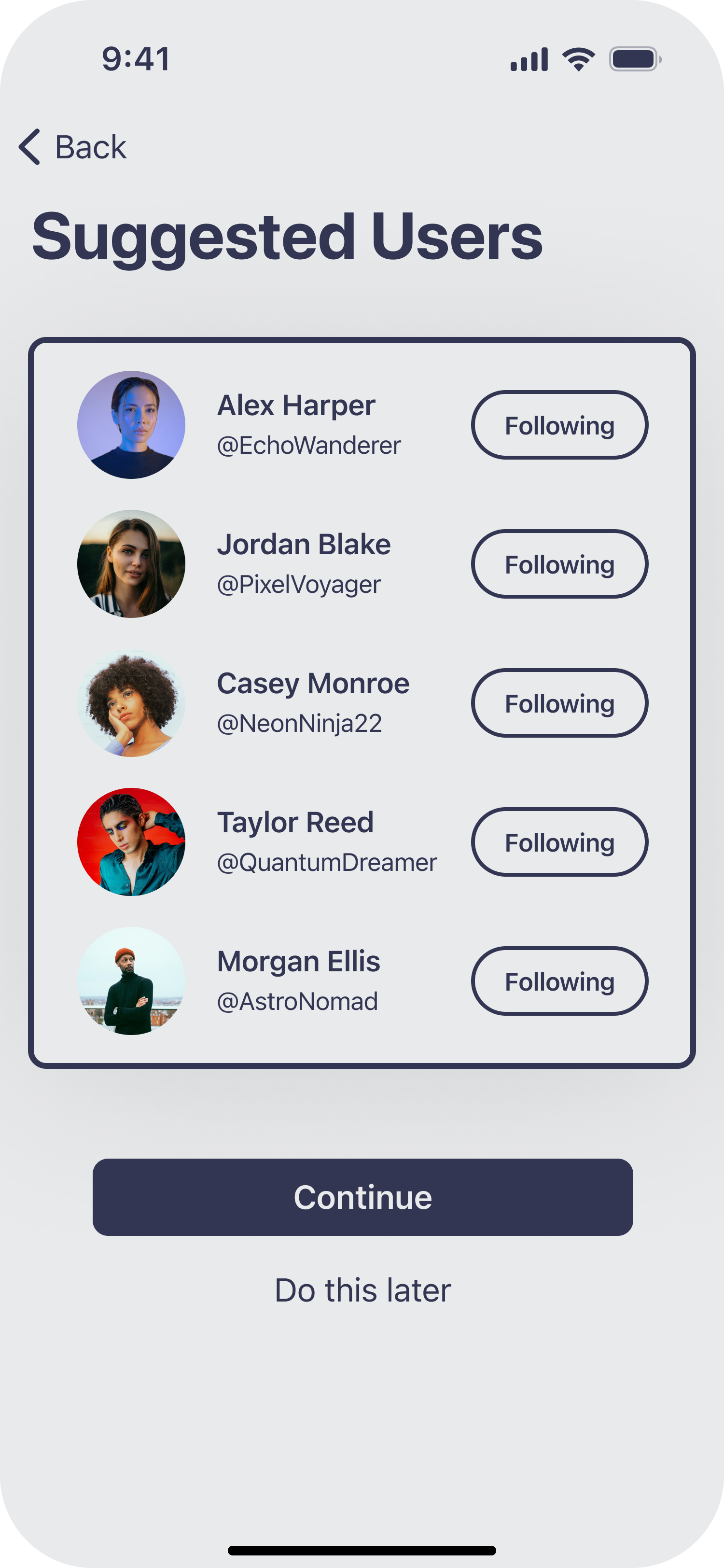
Review suggested users to follow then tap Follow all.
Enter a friend’s username and write something nice, then tap Send.
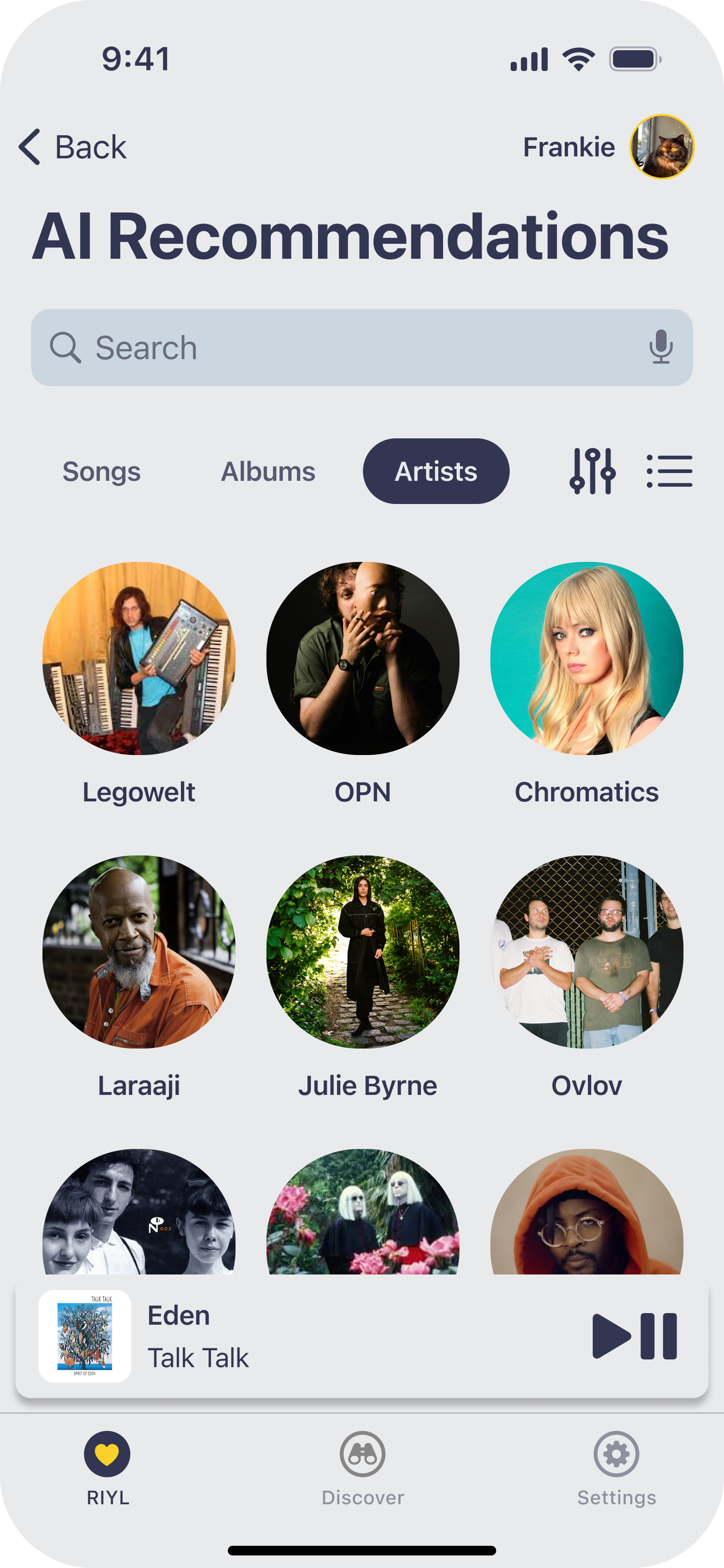
Tap Artists and the grid view icon to view your recommended artists,
Connections confirmed.
The experience begins.
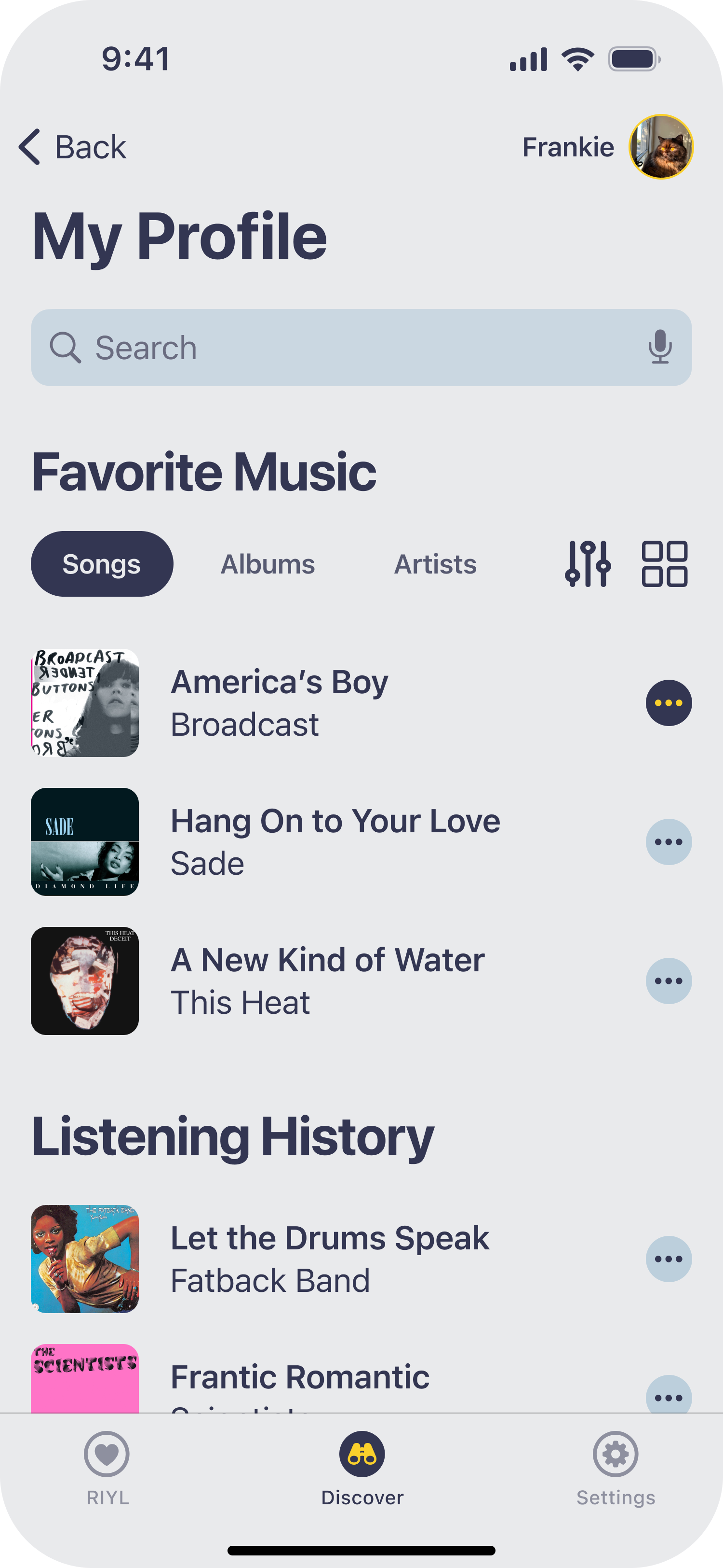
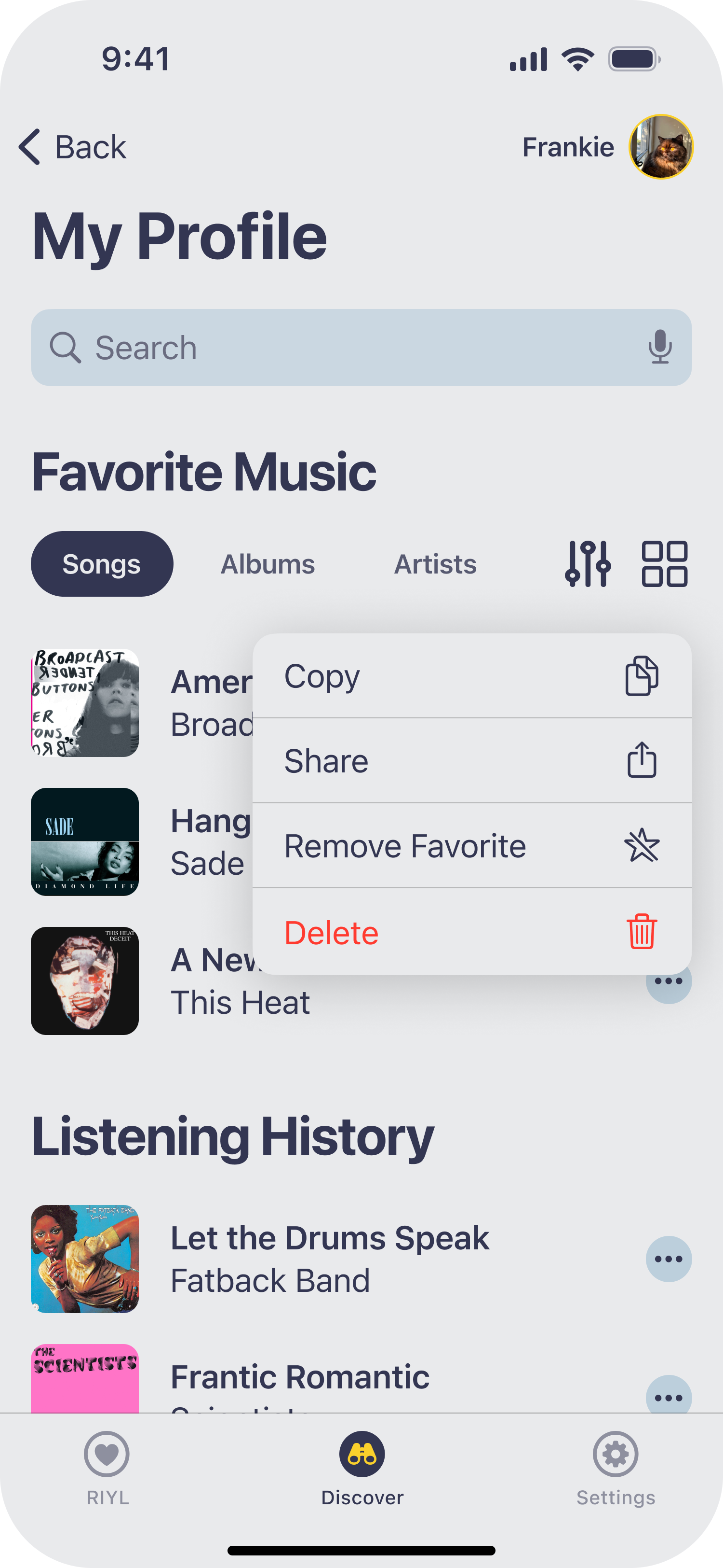
From your profile, view your saved songs and tap the ellipsis icon to start sharing.
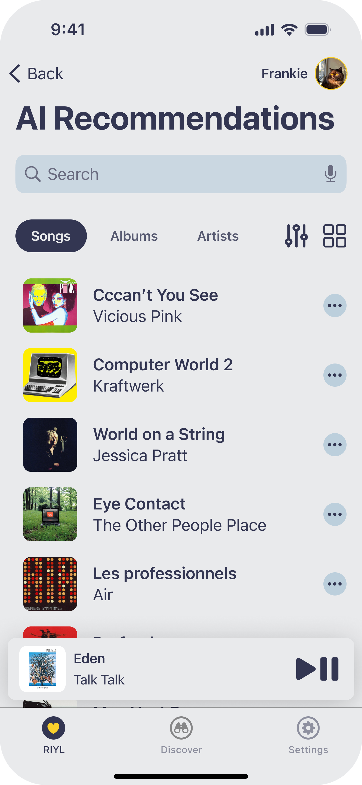
After tapping Okay or the dismiss icon, tap AI Recommendations.
Enter the requested info for account creation then tap Continue.
Tap Share via the contextual menu.
Find your recommended songs, segmented controls, and a grid or list view toggle.
View success toast message.
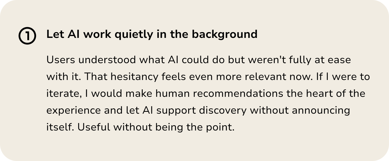
Reflection + Next Steps
This project taught me that the most valuable research findings are often the ones that surprise you. I went in assuming music discovery was the core problem. Users told me otherwise. That early correction shaped everything that followed.
What I would do differently
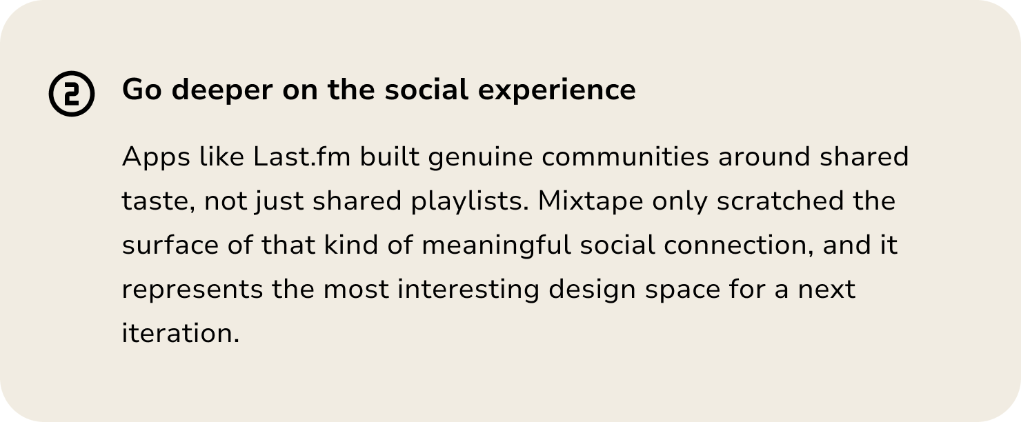
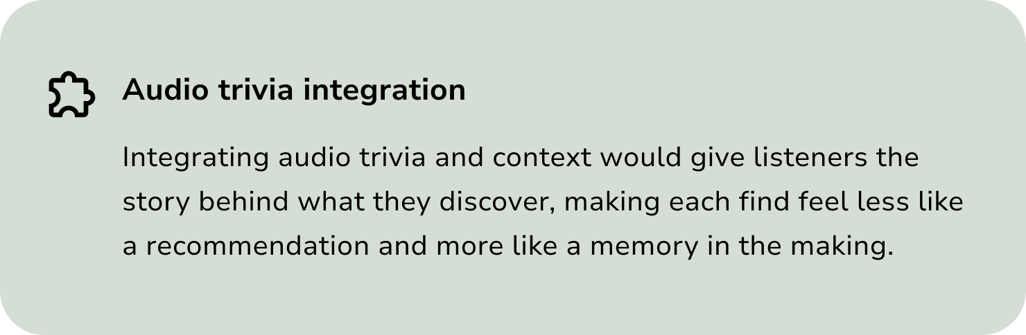
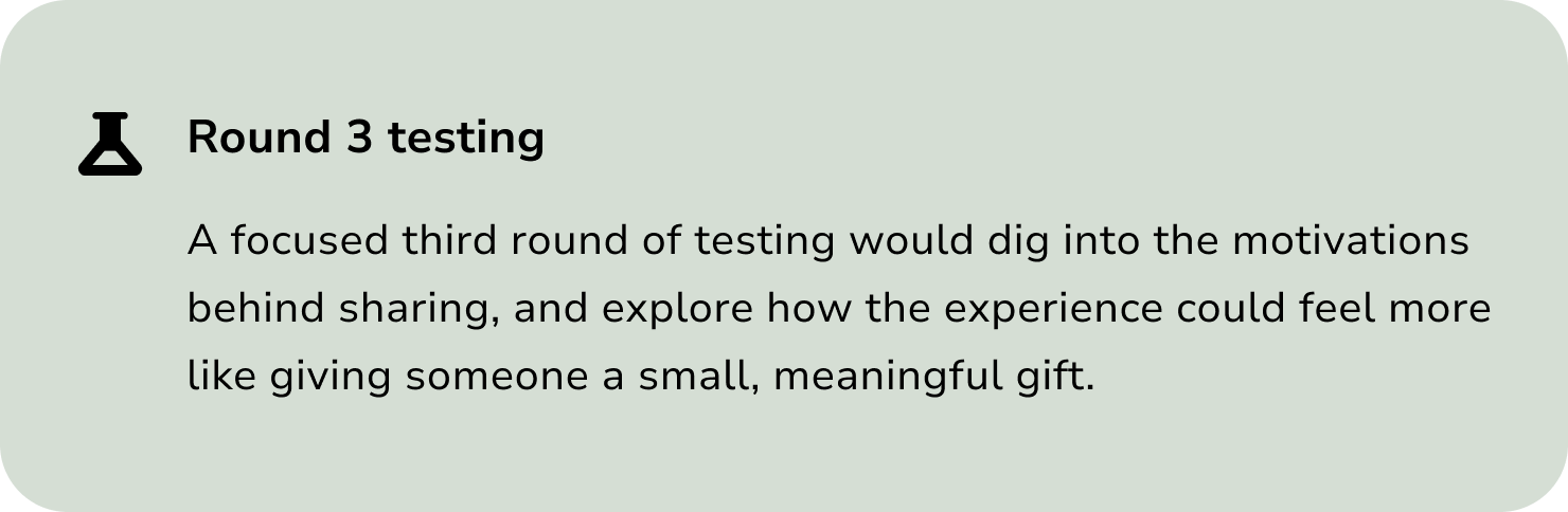
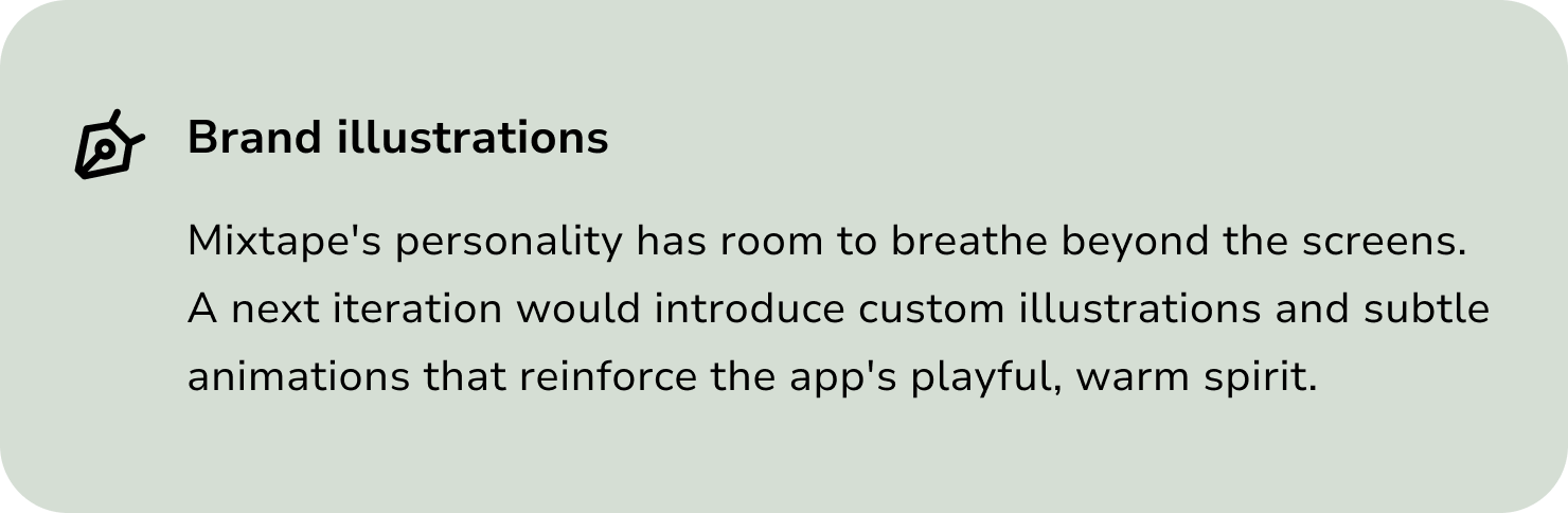
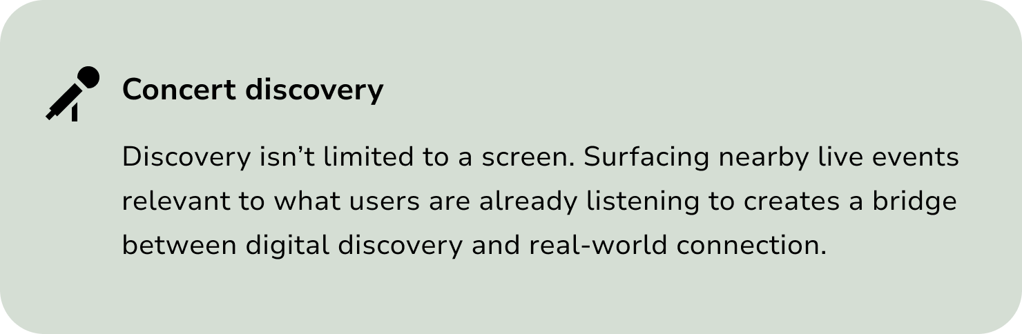
What I would explore next